4.11 Customization of x and y Axes
In this section, we would like to digress a little bit to learn some possible customizations of the x and y axes.
First, let’s review the scatterplot between liv_area and sale_price.
library(ggplot2)
library(r02pro)
ggplot(data = sahp) +
  geom_point(mapping = aes(x = liv_area, y = sale_price))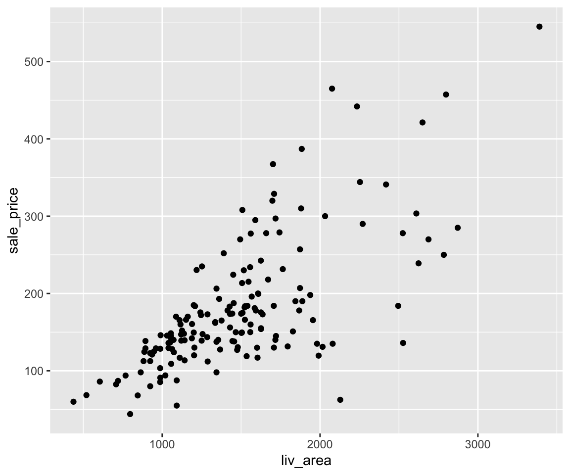
4.11.1 Customizing the Breaks on the x and y Axes
In the above plot, the breaks on the x axis are 1000, 2000, and 3000. The breaks on the y axis are 100, 200, 300, 400, and 500. Sometimes, we may want to customize the breaks, e.g. to show a finer scale. To do this, we can use the scale_x_continous() and scale_y_continuous() functions. Both functions take an argument called breaks which is a numeric vector specifying the desired breaks on the x and y axes.
ggplot(data = sahp) +
  geom_point(mapping = aes(x = liv_area, y = sale_price)) +
  scale_x_continuous(breaks = seq(from = 500, to = 3500, by = 500)) +
  scale_y_continuous(breaks = seq(from = 50, to = 600, by = 50))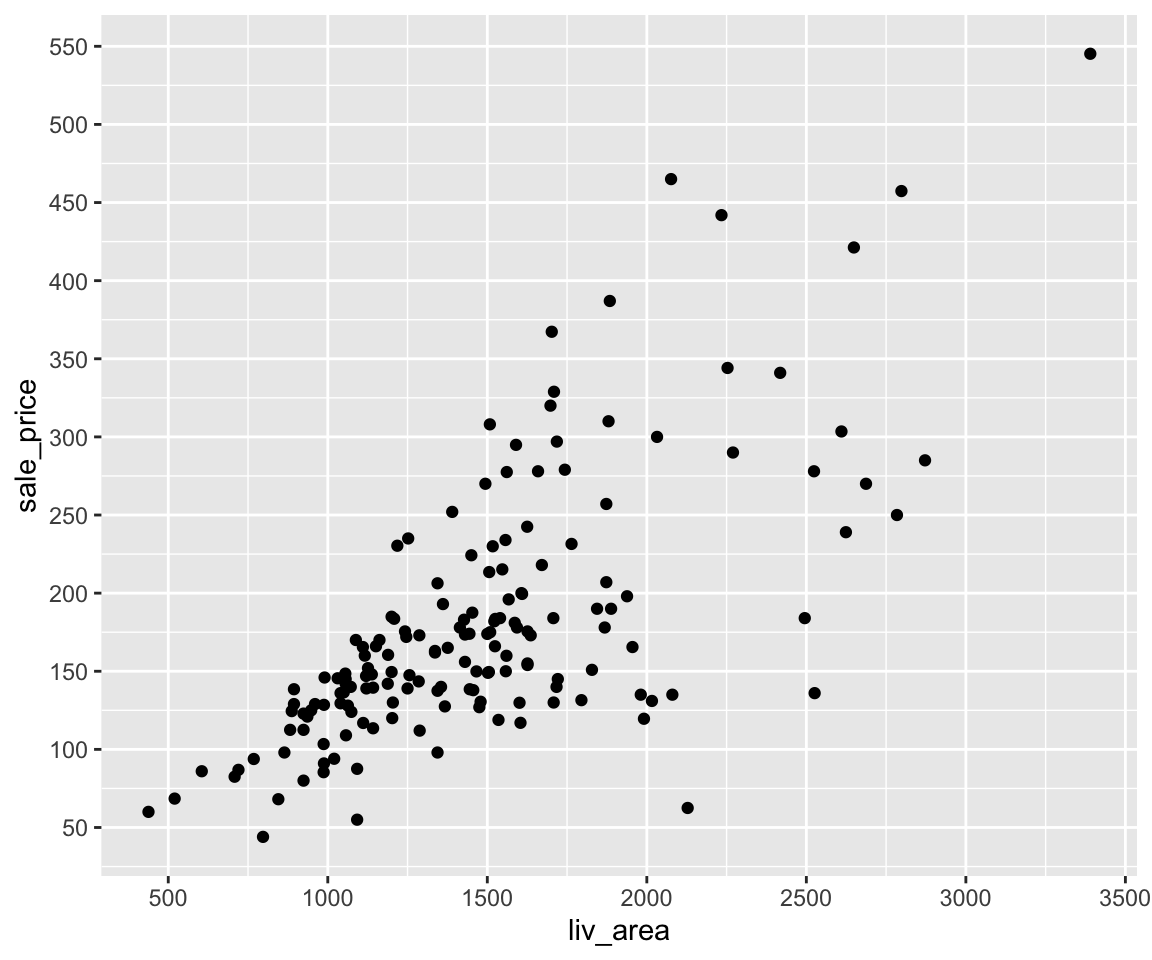
In this example, we have customized the breaks for liv_area to be a equally-spaced sequence from 500 to 3500 with increment 500, and the breaks for sale_price to be another equally-spaced sequence from 50 to 600 with increment 50.
When the specified breaks do not cover the full range of the data, you will see the breaks changed but all the data points are still visible.
ggplot(data = sahp) +
  geom_point(mapping = aes(x = liv_area, y = sale_price)) +
  scale_y_continuous(breaks = seq(from = 300, to = 600, by = 50))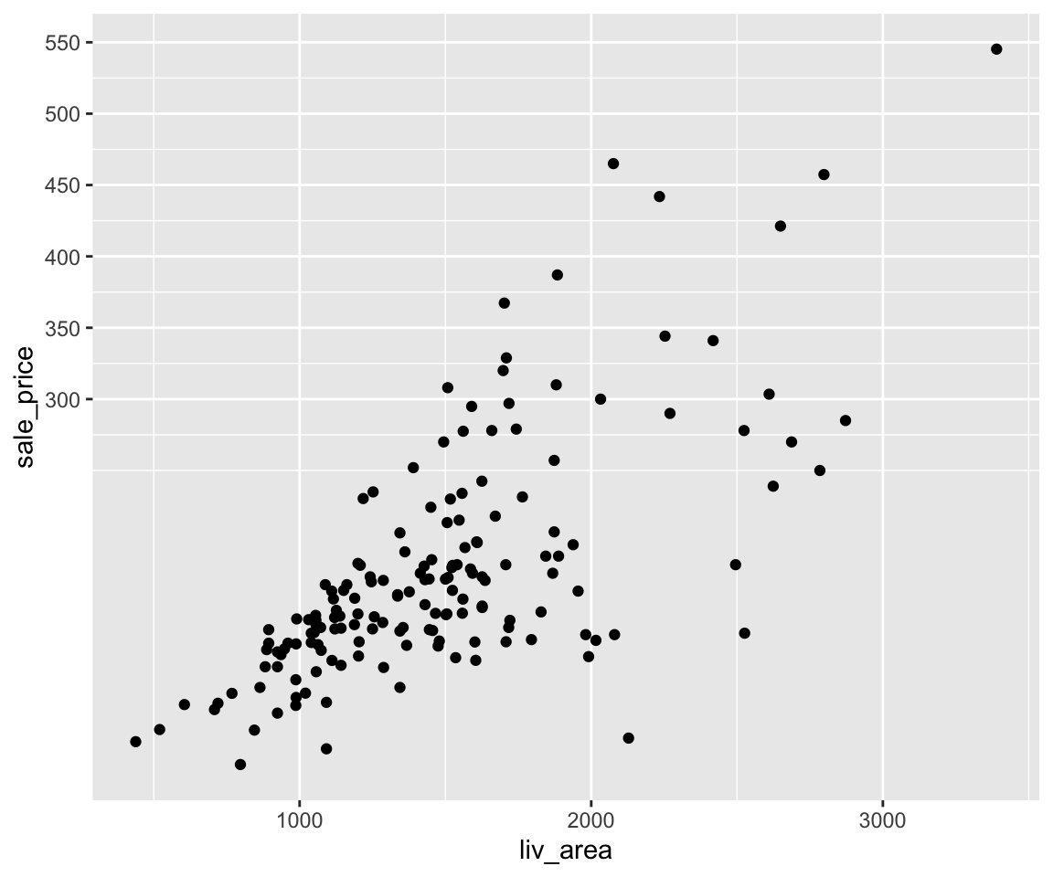
On the other hand, if the specified breaks go beyond the value of the data, ggplot() will only show the breaks values within the data range.
ggplot(data = sahp) +
  geom_point(mapping = aes(x = liv_area, y = sale_price)) +
  scale_x_continuous(breaks = seq(from = 500, to = 5000, by = 500)) +
  scale_y_continuous(breaks = seq(from = 200, to = 800, by = 50))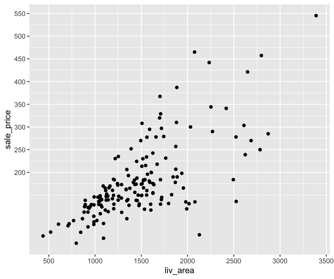
4.11.2 Zoom In to a Specific Region of the Data
Sometimes, you want to zoom in to the specific region of the data to see a finer detail. To do this, you can use the coord_cartesian() function with arguments xlim and ylim for specifying the desired region.
Let’s say we want to focus on the houses with liv_area between 1000 and 2000.
ggplot(data = sahp) +
  geom_point(mapping = aes(x = liv_area, y = sale_price))  +
  coord_cartesian(xlim = c(1000, 2000))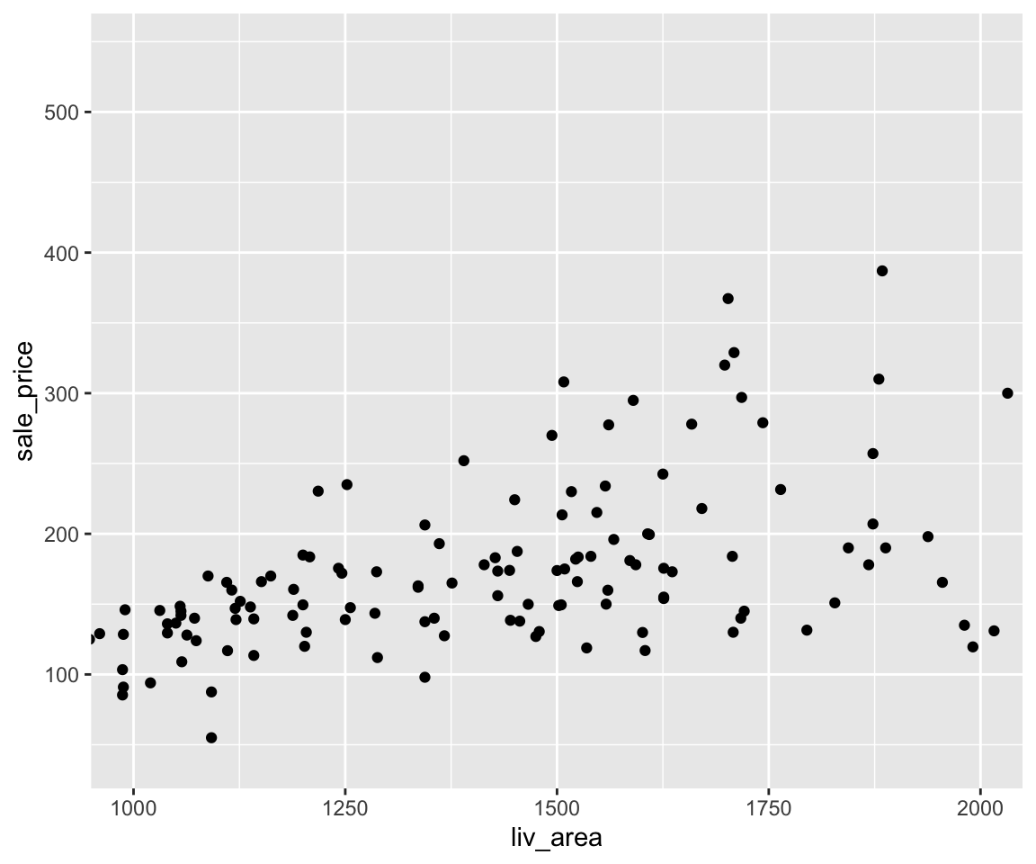
Let’s narrow down further to only the houses with liv_area between 1000 and 2000, and sale_price between 200 and 300.
ggplot(data = sahp) +
  geom_point(mapping = aes(x = liv_area, y = sale_price))  +
  coord_cartesian(xlim = c(1000, 2000), ylim = c(200, 300))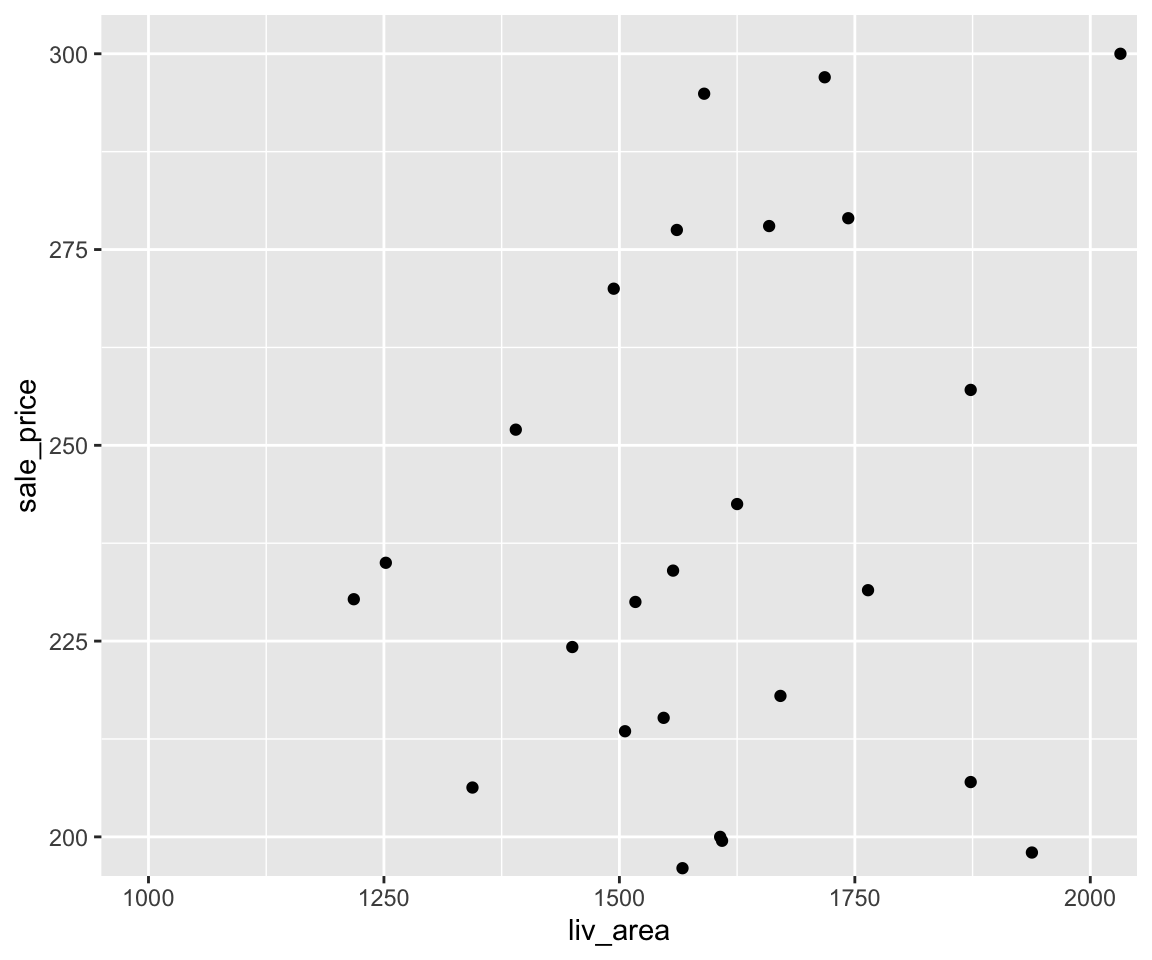
4.11.3 Plot with Transformed Variables and Log-scale Plot
In some applications, instead of using the original variables, you may want to generate a plot with certain transformations of them.
In our scatterplot, maybe we want to change the y-axis to the logarithm of the sale price.
ggplot(data = sahp) +
  geom_point(mapping = aes(x = liv_area, y = log10(sale_price)))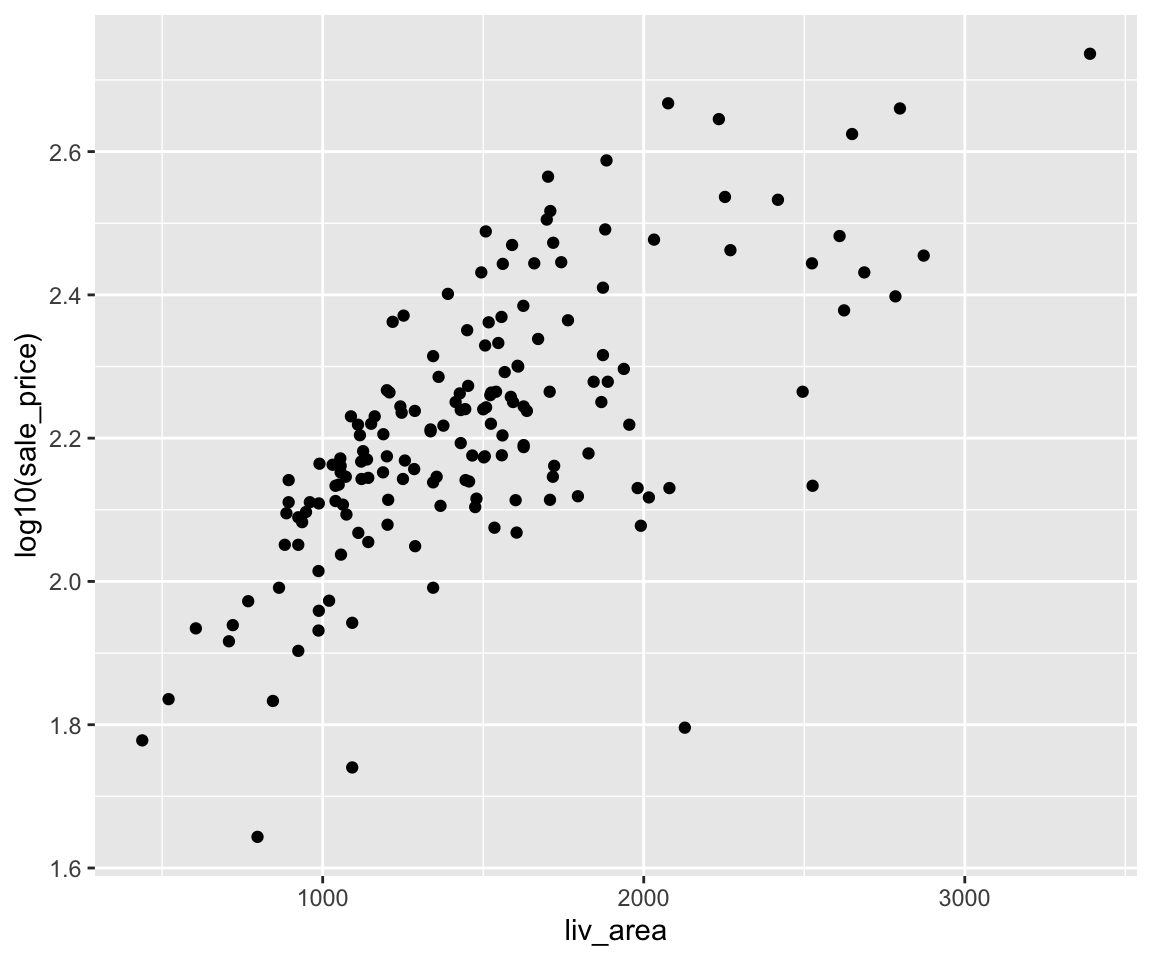
The working mechanism is to first generate a temporary variable log10(sale_price) on the fly, and then generate a scatterplot between liv_area and the transformed variable.
For this particular log10() transformation, an alternative is to generate a Log-scale Plot by setting the trans argument in the scale_y_continous() function. The log-scale plot is a popular way for displaying numerical data over a very wide range of values in a compact fashion.
The default value of trans is "identity" meaning no transformation. There are many different trans choices including log, exp, log10, sqrt, and others.
ggplot(data = sahp) +
  geom_point(mapping = aes(x = liv_area, y = sale_price)) +
  scale_y_continuous(trans = "log10")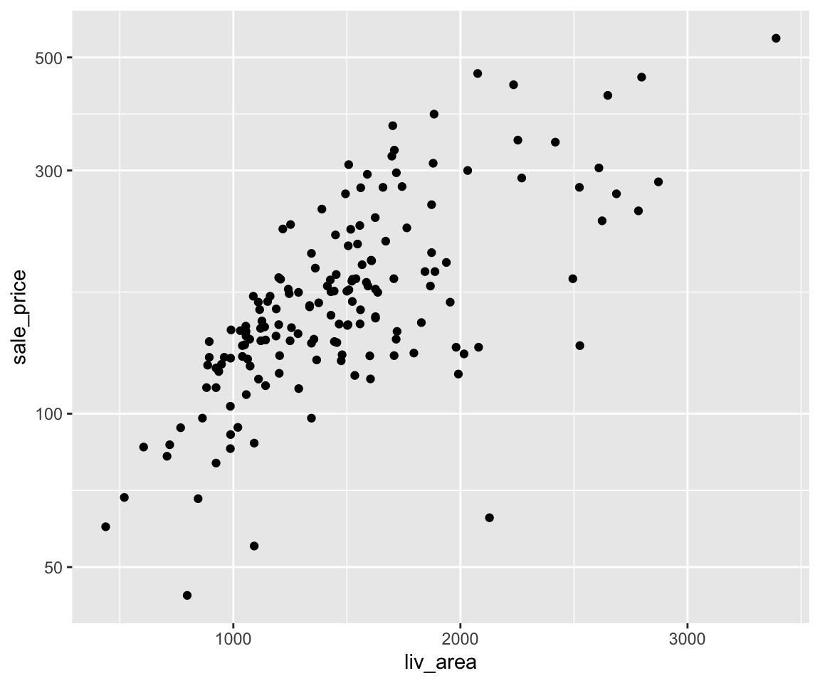
This works in a very different way by change the scale of the y-axis.
4.11.4 Exercises
Use the sahp data set to answer the following questions.
Create a scatterplot between
lot_area(x-axis) andsale_price(y-axis), with the breaks on the x-axis being an equally-spaced sequence from 0 to 40000 with increment 5000, and the breaks on the y-axis being (0, 200, 300, 550).For the plot in Q1, create a zoom-in plot where
lot_areais between 10000 and 15000, andsale_priceis between 200 and 300.For the plot in Q1, create a corresponding log-log plot, where both the x-axis and y-axis are in log-scale.