6.10 Density Plots
In Section 6.9, we have learned to use geom_histogram() as a way to visualize the distribution of a continuous variable. In addition, we also showed that it can be used to generate a piece-wise constant estimate of the probability density function. Today, we will introduce another popular visualization method for continuous data, namely the density plots. First, let’s review the geom_histogram() for estimating the density function.
library(ggplot2)
library(r02pro)
ggplot(data = gm2004) +
  geom_histogram(mapping = aes(x = cholesterol,
                               y = ..density..))
#> `stat_bin()` using `bins = 30`. Pick better value `binwidth`.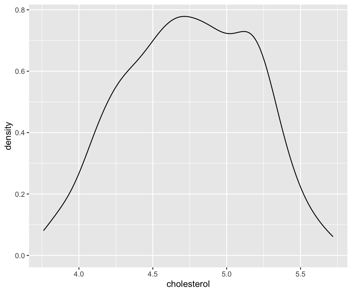
There are 30 bins by default. You may notice that this density estimate is not smooth, sometimes we may prefer a smoothed estimate. Then, we can use the geom_density() function to achieve this.
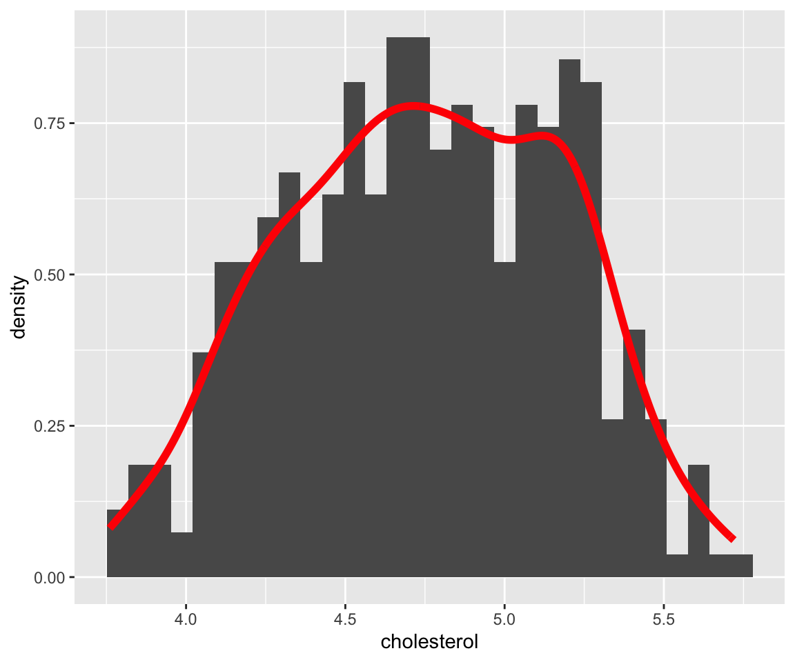
This plot shows the so-called “kernel density estimate”, a popular way to estimate the probability density function from sample. The density estimate can be viewed as a smoothed version of the histogram. We can combine the two plots together using global aesthetic mapping.
ggplot(data = gm2004,
       aes(x = cholesterol)) +
  geom_histogram(aes(y = ..density..)) +
  geom_density(color = "red", size = 2)
#> `stat_bin()` using `bins = 30`. Pick better value `binwidth`.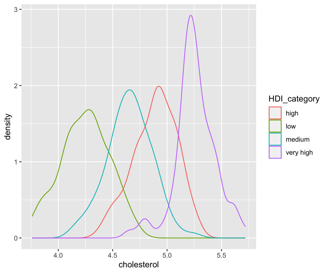
Here, we added some global aesthetics in geom_density() to make the density plot red and the line width by setting size = 2. It is clear that the density plot is a useful alternative to the histogram for visualizing continuous data.
6.10.1 Aesthetics in Density Plots
Now, let’s introduce some commonly used aesthetics for density plots.
a. Color
ggplot(data = remove_missing(gm2004,
                             vars = "HDI_category")) +
  geom_density(aes(x = cholesterol,
                   color = HDI_category))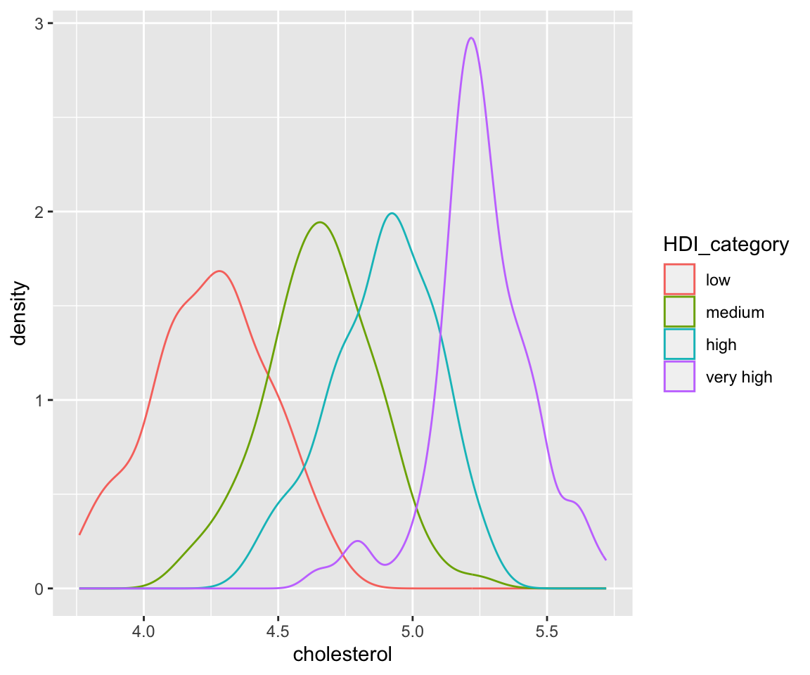
Here, we divide the data into four groups according to the value of HDI_category (human development index category), then generate separate density estimates with different colors. It is interesting to observe that the countries with very high HDI values have higher cholesterol values compared with countries with lower HDI values.
Here, we can also manually reorder the factor levels just like in Bar Chart:
library(forcats)
my_gm2004 <- remove_missing(gm2004,
                             vars = "HDI_category")
my_gm2004$HDI_category <- fct_relevel(my_gm2004$HDI_category,
                                       c("low", "medium", "high", "very high"))
ggplot(data = my_gm2004) +
  geom_density(aes(x = cholesterol,
color = HDI_category)) 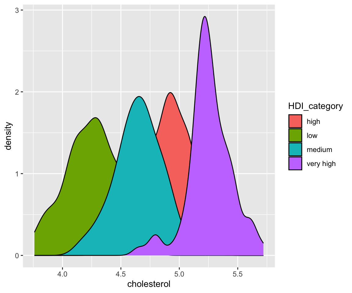
Here, a copy of the original dataset was created with the missing value of HDI_category removed and the level reordered manually.
b. Fill
Another way to generate different density estimates is to use the fill aesthetic. Let’s see the following example.
ggplot(data = remove_missing(gm2004,
                             vars = "HDI_category")) +
  geom_density(aes(x = cholesterol,
                   fill = HDI_category))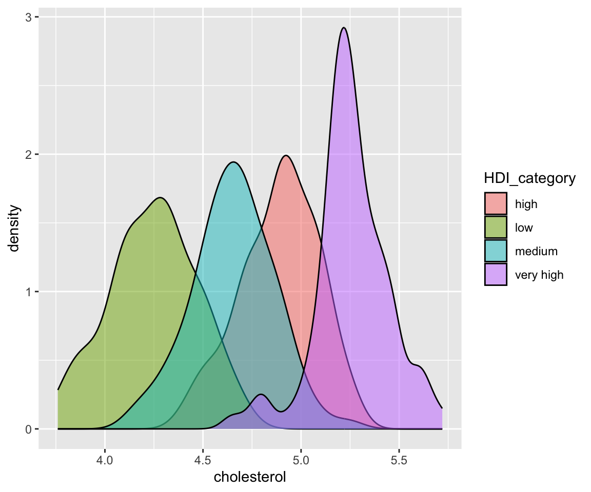
The fill aesthetic also divides the data into groups according to HDI_category, then generate separate density estimates. The difference between fill and color aesthetics is that fill generates shaded areas below each density curve with different colors while color generates density curves with different colors. As we can see from the plot, there is a substantial overlap of the shaded areas. To fix this issue, we can change the transparency of the shades by adjusting the value of the alpha aesthetic.
ggplot(data = remove_missing(gm2004,
                             vars = "HDI_category")) +
  geom_density(aes(x = cholesterol,
                   fill = HDI_category),
               alpha = 0.5)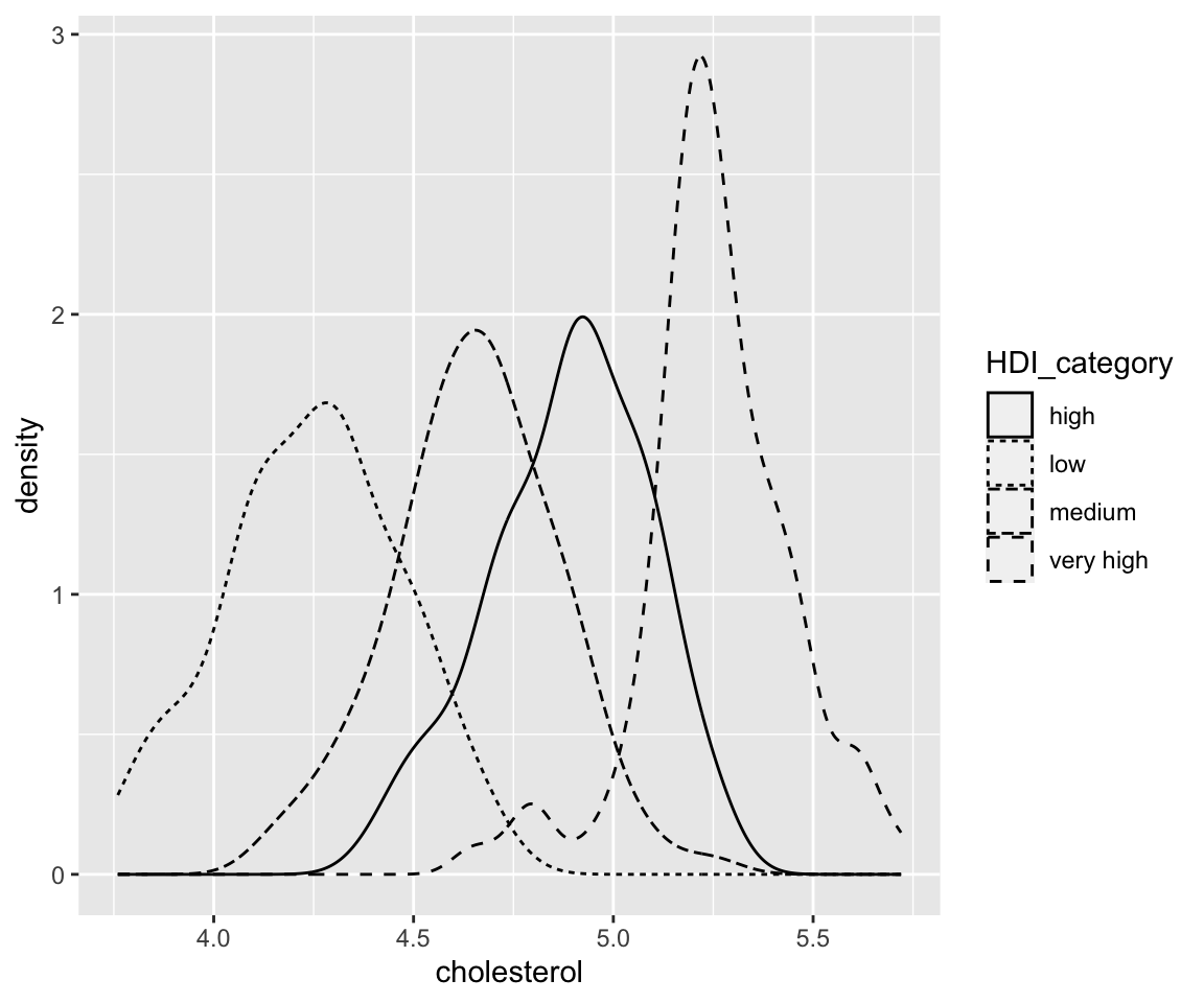
We can now see all shaded areas in a clear way.
c. Linetype
We can also use different linetypes for different curves.
ggplot(data = remove_missing(gm2004,
                             vars = "HDI_category")) +
  geom_density(aes(x = cholesterol,
                   linetype = HDI_category))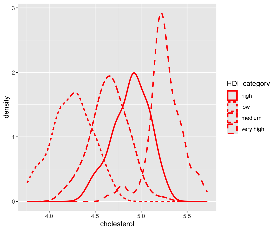
d. Constant-Valued Aesthetics
As usual, we can also set constant-valued aesthetics for geom_density() and combine it with the mapped aesthetics.
ggplot(data = remove_missing(gm2004,
                             vars = "HDI_category")) +
  geom_density(aes(x = cholesterol,
                   linetype = HDI_category),
               size = 1,
               color = "red")
Here, the size controls the width of the density curve.
6.10.2 Exercises
Use the sahp data set to answer the following questions.
Create density plot on the living area (
liv_area) with dashed lines and different colors for different values ofkit_qual. What conclusions can you draw from the plot?Try to create density plot for
kit_qual. Do you think this plot is informative? If not, create a plot that captures the distribution ofkit_qual.
