7.4 Heat Map
A heat map is a data visualization technique that shows magnitude of a phenomenon in the two dimensional space.
First of all, we prepare a smaller data set from the gm2004 data in the r02pro package, to better illustrate the mechanism of a heat map.
library(r02pro)
library(tidyverse)
country_list <- c("Australia",
                  "China",
                  "United States",
                  "United Kingdom",
                  "South Africa")
sgm2004 <- gm2004 %>%
  dplyr::filter(gender == "female", country %in% country_list) %>%
  select(country, population, BMI, cholesterol, GDP_per_capita)
Note that during the data preparation process, we have used the filter() and select() functions, which filters observations and select variables from a tibble, respectively. They will be covered in detailed in the next Chapter.
7.4.1 Using the heatmap() function
We will first introduce the function heatmap(), which is available in base R. To use the function, you need to convert the object into a matrix using as.matrix() and specify the rownames of the object.
sgm2004_mat <- as.matrix(sgm2004[, -1])
rownames(sgm2004_mat) <- country_list
sgm2004_mat
#>                population  BMI cholesterol GDP_per_capita
#> Australia           20200 26.6        5.26          50.30
#> China             1330000 22.8        4.53           3.39
#> United States       60300 26.7        5.40          42.80
#> United Kingdom     295000 28.1        5.22          52.80
#> South Africa        47900 29.0        4.63           5.11
heatmap(sgm2004_mat)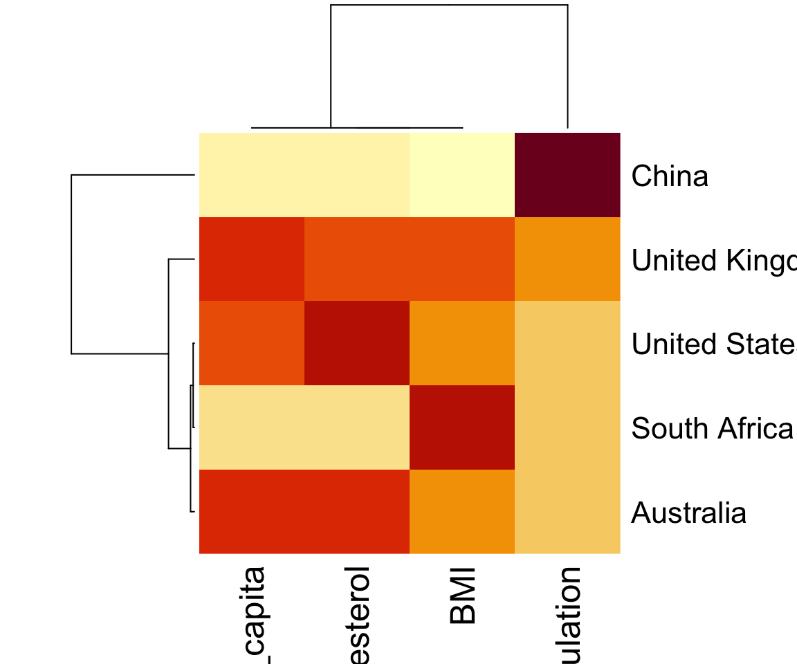
The working of mechanism of a heatmap is that it creates a grid of colored gray-scale rectangles with colors corresponding to the values in the corresponding matrix. By default, the rows of the input matrix are scaled to have mean zero and standard deviation one. In our example, perhaps it is more meaningful to scale the columns as the represent different variables. We can achieve this by setting scale = "column".
In addition to generating the heat map, the heatmap() function, by default, also run a clustering algorithm on both the rows and columns, and visualize the results with dendrograms. To turn off the dendrograms, you can set arguments Rowv = NA and Colv = NA for the row and column dendrograms, respectively.
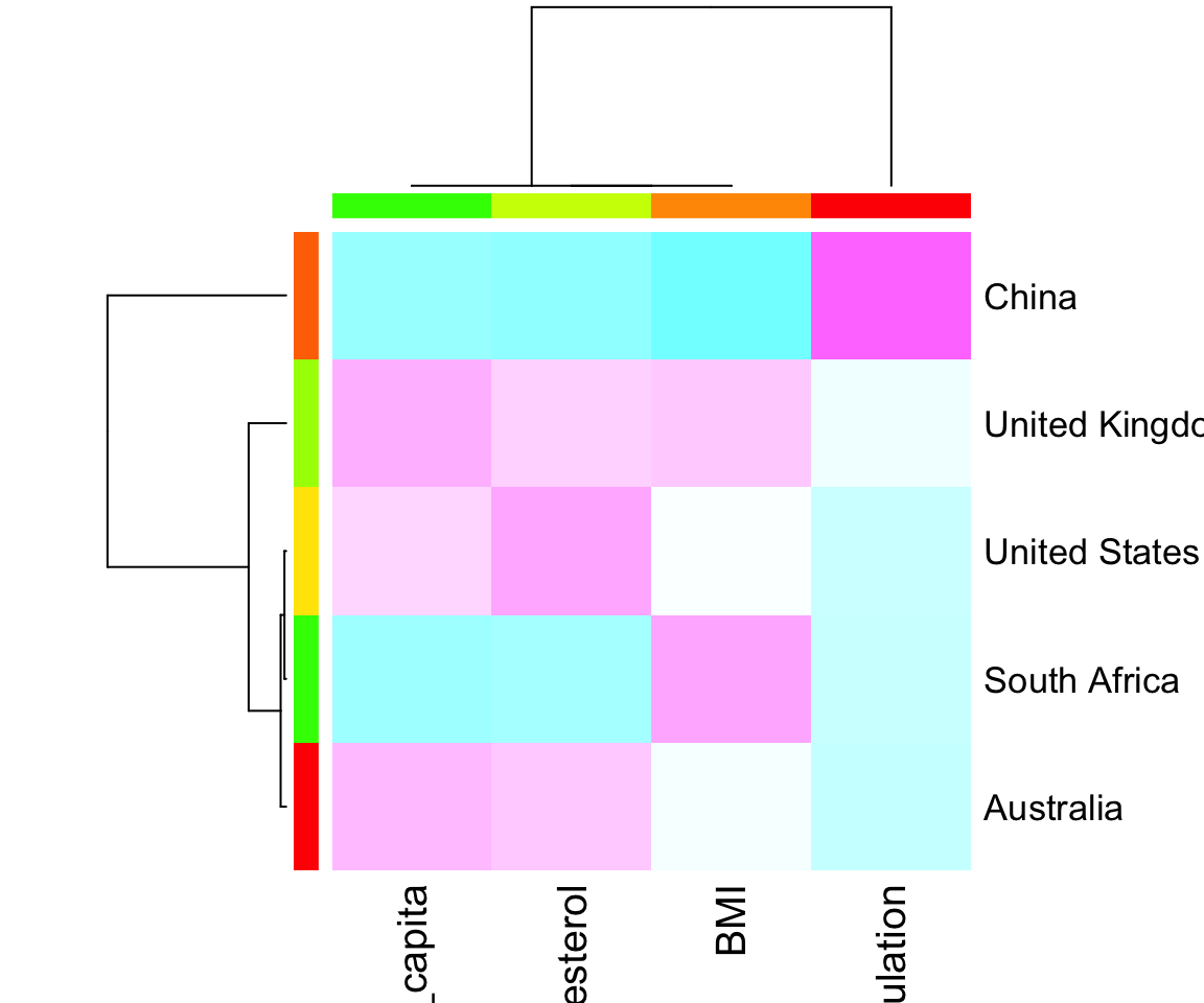
In addition, it is easy to customize the colors of the heatmap.
rc <- rainbow(nrow(sgm2004_mat), start = 0, end = .3)
cc <- rainbow(ncol(sgm2004_mat), start = 0, end = .3)
heatmap(sgm2004_mat,
        col = cm.colors(256),
        scale = "column",
        RowSideColors = rc,
        ColSideColors = cc)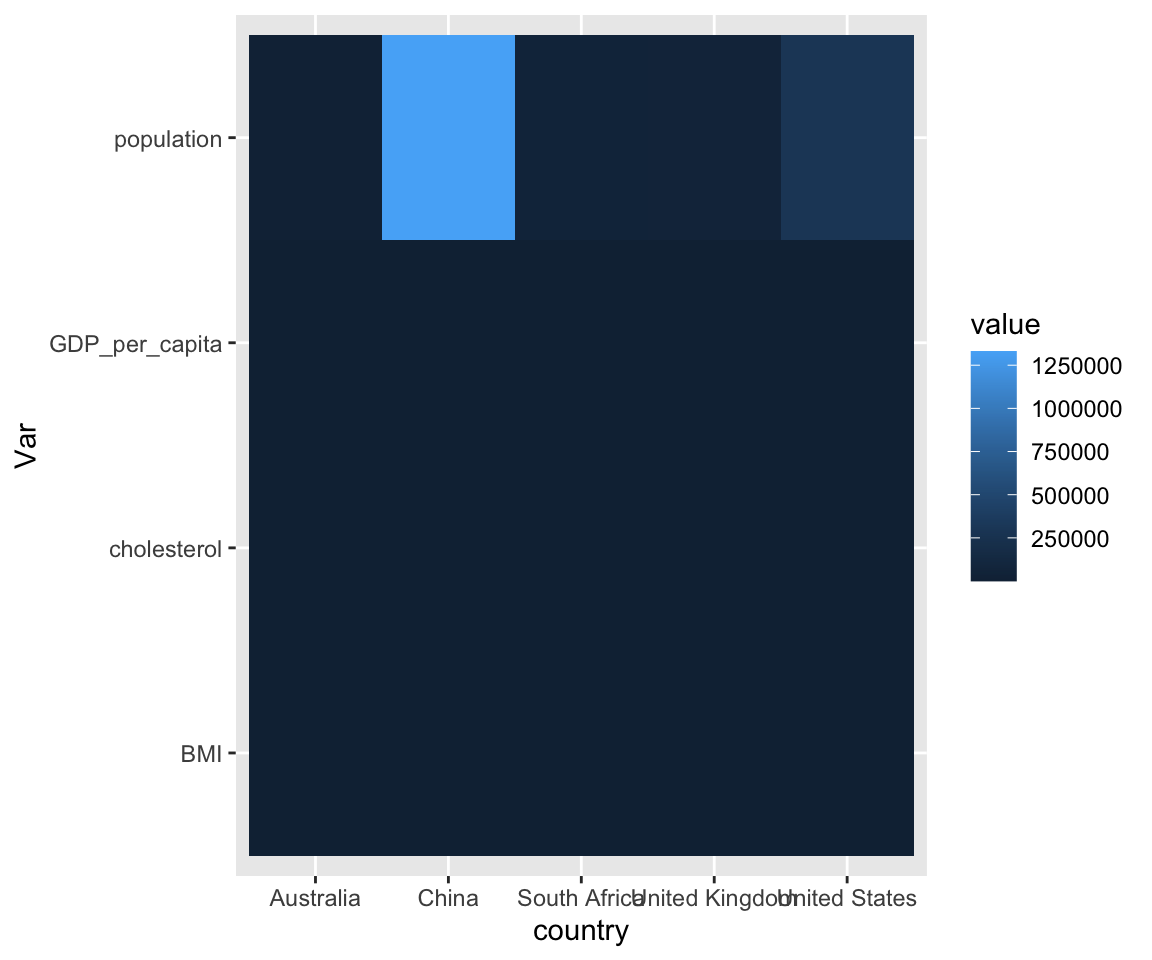
7.4.2 Using geom_tile() in ggplot2
In the ggplot2 packages, there is no geom that directly generates a heatmap, however, we can use the geom_tile() on a transformed data format using pivot_longer(), which will be introduced in Section 9.1.
sgm2004_long <- sgm2004 %>%
  pivot_longer(cols = 2:5,
               names_to = "Var")
ggplot(sgm2004_long) +
  geom_tile(mapping = aes(x = country,
                          y = Var,
                          fill = value))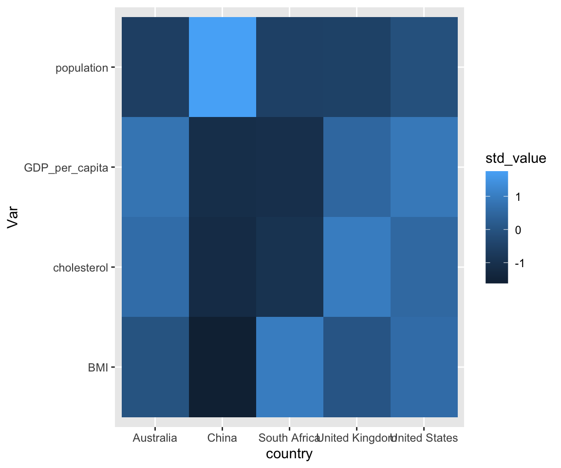
Here, since the variables are not in the same scale, the colors of the tiles are dominated by the population value. As before, we need to scale the variables to make them comparable.
sgm2004_long <- sgm2004_long %>%
  group_by(Var) %>%
  mutate(std_value = scale(value)) %>%
  ungroup()
ggplot(sgm2004_long) +
  geom_tile(mapping = aes(x = country,
                          y = Var,
                          fill = std_value))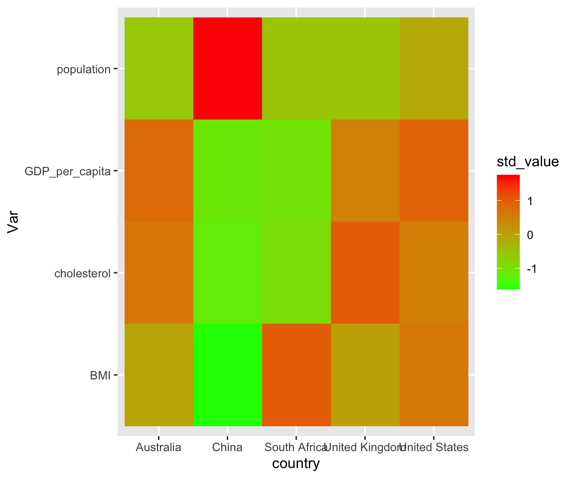
Now, the heatmap looks more informative that shows the relative magnitude across different countries for each variable considered.
Like in Section 6.3, you can customize the range of the tile colors by specifying the low and high parameters in the scale_fill_gradient() function.
ggplot(sgm2004_long) +
  geom_tile(mapping = aes(x = country,
                          y = Var,
                          fill = std_value)) +
  scale_fill_gradient(low = "green",
                      high = "red")
In this section, we introduced two approaches to creating heat maps: the base R heatmap() function and the geom_tile() function in ggplot2. Both approaches require careful attention to scaling, since variables measured in different units can dominate the color mapping. The heatmap() function also provides built-in clustering and dendrogram visualization.
7.4.3 Exercises
Using the
gm2004dataset from the r02pro package, create a subset with 4 countries of your choice. Select the variablescountry,BMI,cholesterol, andlife_expectancy. Create a heatmap using theheatmap()function withscale = "column".Using the same subset from Exercise 1, create a heatmap using
geom_tile()in ggplot2. Remember to first transform the data usingpivot_longer()and scale the values usingscale()within each variable.Customize the heatmap from Exercise 2 by changing the color gradient to go from
"white"to"darkblue"usingscale_fill_gradient().Create a heatmap using
heatmap()on the same data, but turn off both row and column dendrograms usingRowv = NAandColv = NA.
