6.2 ggplot Aesthetics (I): Constant-Valued Aesthetics
Having learned how to generate a basic scatterplot using geom_point() in Section 6.1, we are now ready to introduce one of the most important ingredients in a geom, namely, the aesthetics. Aesthetics include distinct features that you can change that affect the appearances of a plot, including color, shape, and size.
There are in general three kinds of aesthetics:
Constant-Valued Aesthetics: this type of aesthetics change the corresponding feature of a plot globally (for example,
color = "red"will make everything red). This type of aesthetic specification appears as an argument of the geoms (for examplegeom_point()). This will be the focus of our current section.Local Aesthetic Mapping: this type of aesthetics (for example,
color) will take possibly different values (different color values) for different data points depending on the mapped variables, only for the current geom. This type of aesthetic specification appears as an argument of theaes()function of the corresponding geom. We will cover this type of aesthetic in the next Section (Section 6.3).Global Aesthetic Mapping: this type of aesthetics will use possibly different values for different data points depending on the mapped variable, at the global level, which will be passed to all individual geoms. This type of aesthetic specification appears as an argument of the
aes()function, which is an argument of theggplot()function. We will cover this type of aesthetic in Section 6.7, where multiple geoms are used.
Note that although we will introduce aesthetics via the example of scatterplot, they are used for all kinds of plots which will be covered at a later time.
Let’s first review the code we used to generate the scatterplot between sugar and cholestrol in the gm2004 dataset.
library(ggplot2)
library(r02pro)
ggplot(data = gm2004) +
  geom_point(mapping = aes(x = sugar, y = cholesterol))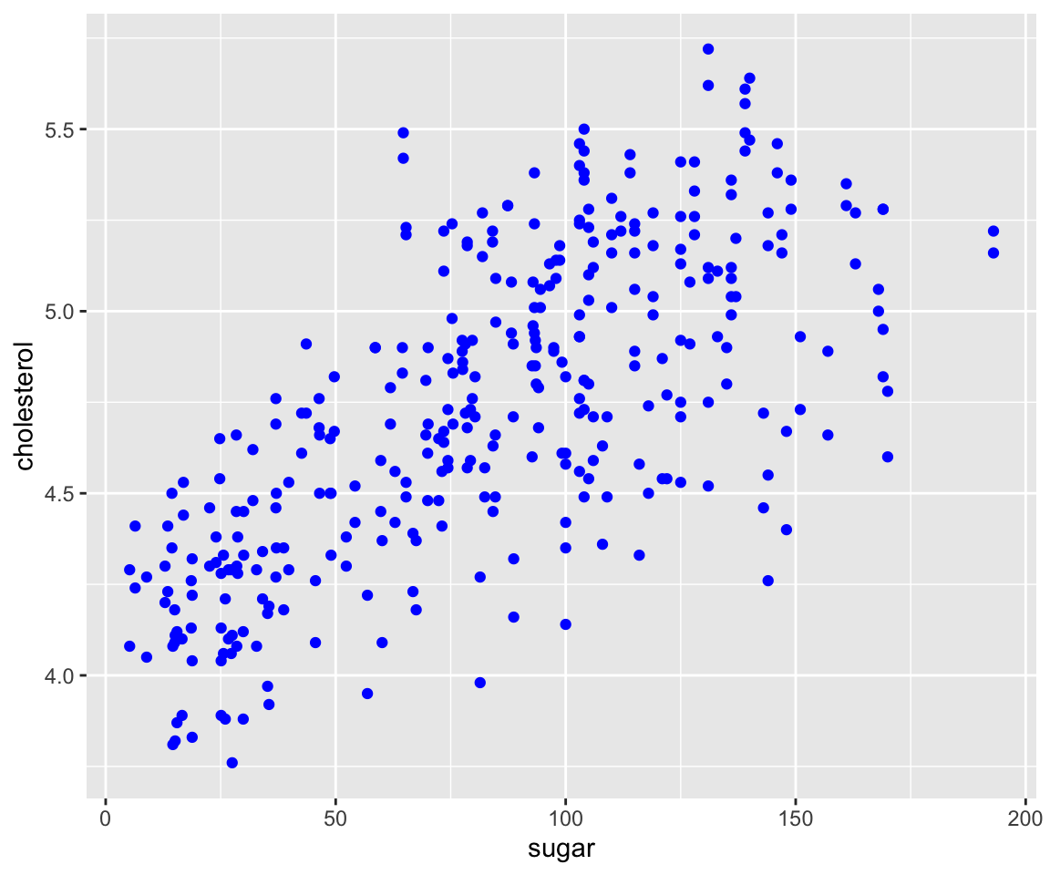
Now, let’s see how to set Constant-Valued Aesthetic in geom_point().
a. Color
To change the color of all points, you can add a color argument in the geom_point() function. Note that it is placed outside of the aes() function, which is different from aesthetic mappings, to be covered in the next section.
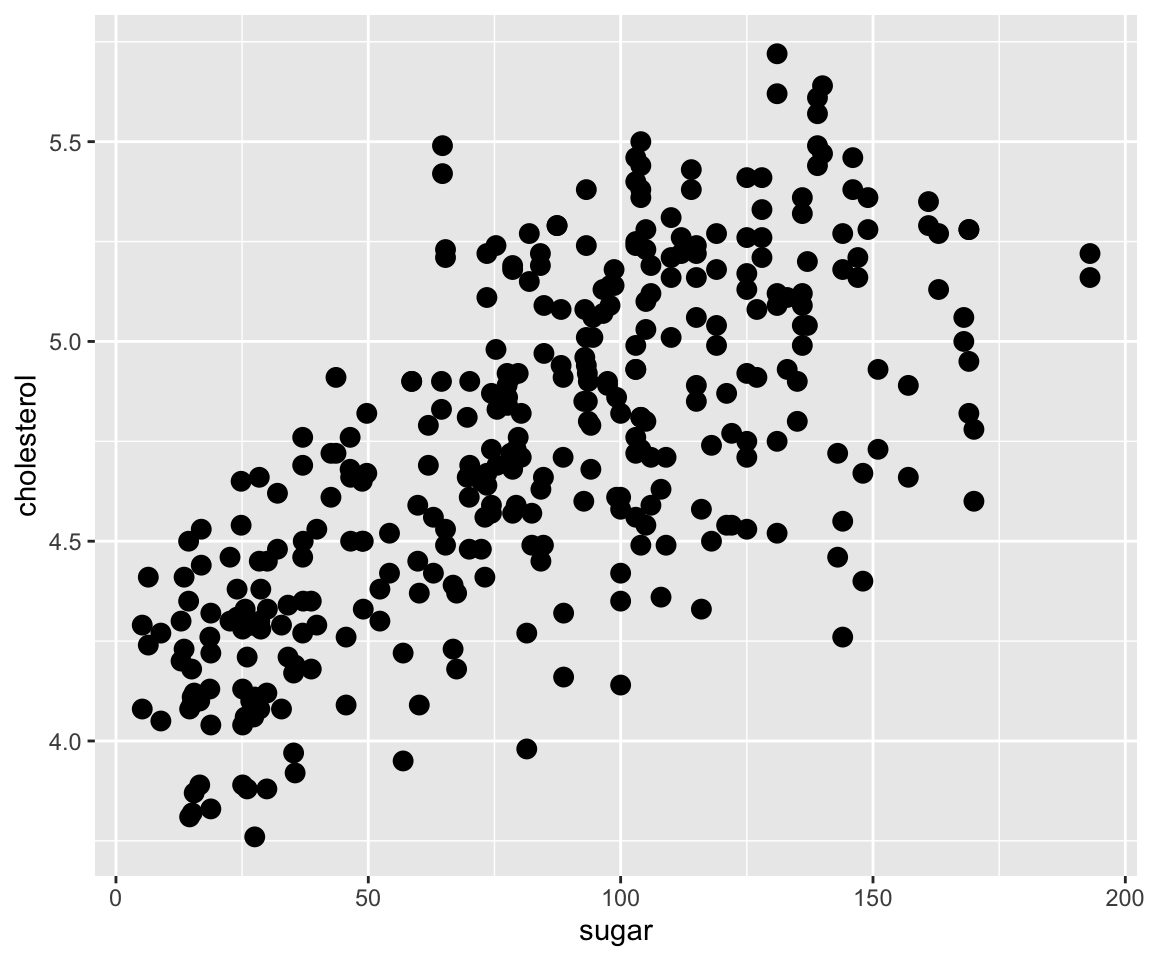
Clearly, all points are changed to blue.
b. Size
Similarly, you can set the size aesthetic in the geom_point() function to change the size of the all points.
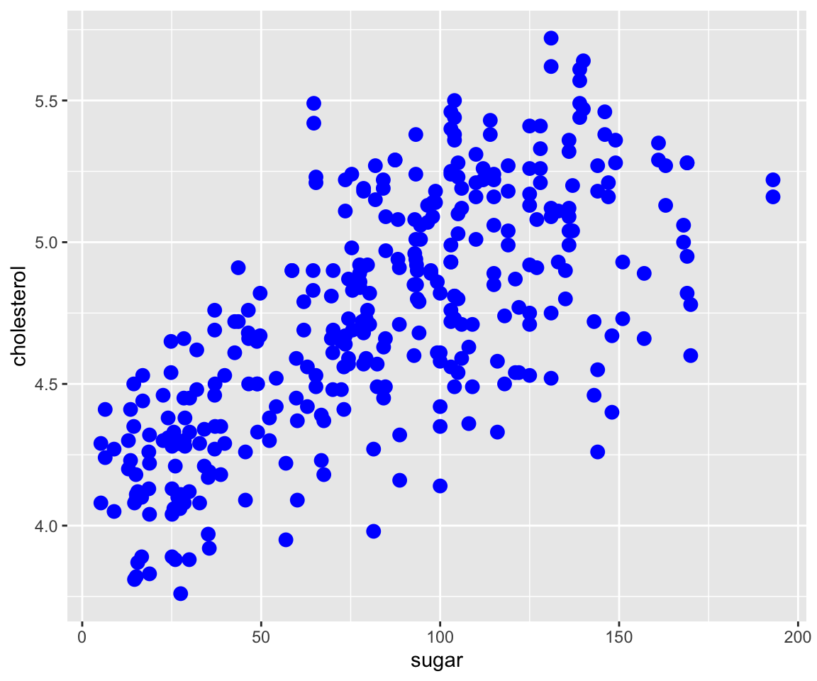
Note that it is very common to set multiple constant valued aesthetic in a geom function.
ggplot(data = gm2004) +
  geom_point(mapping = aes(x = sugar, y = cholesterol),
             color = "blue",
             size = 3)
You may notice that the points are now bigger than before. Looking at the plot, some points are overlapping with each other, which is sometimes called overplotting. To solve this issue, you can change the transparency level of the points by setting the alpha aesthetic.
c. Transparency
ggplot(data = gm2004) +
  geom_point(mapping = aes(x = sugar, y = cholesterol),
             color = "blue",
             size = 3,
             alpha = 0.5)
By setting alpha = 0.5, the points become more visible and the overplotting problem is largely alleviated.
d. Shape
Lastly, we can also change the shape of the points from the default 1 (circle) to other shapes by the shape argument in geom_point().
ggplot(data = gm2004) +
  geom_point(mapping = aes(x = sugar, y = cholesterol),
             color = "blue",
             size = 3,
             alpha = 0.5,
             shape = 2)
Now, we have all points blue, size of 3, of triangle shape, and of transparency level 0.5. Recall the collection of all shapes is available in Figure 6.1.
You are welcome to try different combinations of global aesthetics.
6.2.1 Exercises
Using the
sahpdataset, create a scatterplot with ggplot2 to visualize the relationship betweenlot_area(on the x-axis) andsale_price(on the y-axis) with all points of color purple and size 2.Using the
gm2004dataset, create a scatterplot with ggplot2 to visualize the relationship betweenBMI(on the x-axis) andcholesterol(on the y-axis) with all points of color pink, size 3, transparency 0.3, and shape of diamond.
