6.4 Customization in ggplot
In this section, we would like to digress a little bit to show some possible customizations on the axes, labels, and titles.
Let’s first review the following scatterplot introduced in Section 6.1.
library(ggplot2)
library(r02pro)
ggplot(data = gm2004) +
  geom_point(mapping = aes(x = sugar,
                           y = cholesterol))
Before introducing customization, let’s introduce a way to save the current plot and add additional layers, to avoid repetition of codes. For example, we can break down the previous code into the following two steps.
This is equivalent to the previous plot. Let’s save the whole plot into an R object.
6.4.1 Customization of Labels and Titles
a. Customize x and y labels and title
By default, the x and y labels are the variables names, and there is no title for the plot. You can customize the x and y labels using the xlab() and ylab() function, and add a title with the ggtitle() function.
my_plot_2 <- my_plot +
  xlab("Sugar (grams per person and day)") +
  ylab("Cholesterol (mmol/L)") +
  ggtitle("Cholesterol vs. Sugar")
my_plot_2
b. Customize the font of the x and y breaks
In addition, you can further customize the font of the x and y breaks using the theme() function with the argument axis.text.
c. Customize the font of labels
To customize the font, you can use axis.title argument to change the size, color, and face of the labels.
d. Customize the font of the title
Similarly, you can use the plot.title argument to customize the font of the title.
e. Center the title
Sometimes, we may want to center the title. We can achieve this by setting the hjust parameter.
my_plot_2 + theme(plot.title = element_text(size = 24,
                                     color = "magenta",
                                     face = "bold",
hjust = 0.5)) 
f. Mix
Apparently, you are free to mix all the different customizations. Let’s see an example as below.
my_plot_2 + theme(axis.title = element_text(size = 18,
                                     color = "red",
                                     face = "italic"),
           axis.text = element_text(size = 12,
                                    color = "blue"),
           plot.title = element_text(size = 24,
                                     color = "magenta",
                                     face = "bold",
                                     hjust = 0.5))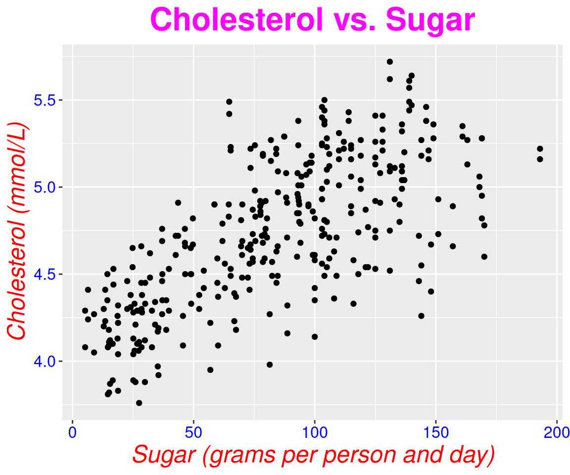
g. Save as a theme
As you can see from the code, the code gets complicated if we want to customize many things at the same time. To save time, you can actually save the desired into an R object and reuse it later.
mytheme <- theme(axis.title = element_text(size = 18,
                                           color = "red",
                                           face = "italic"),
                 axis.text = element_text(size = 12,
                                          color = "blue"),
                 plot.title = element_text(size = 24,
                                           color = "magenta",
                                           face = "bold",
                                           hjust = 0.5))
Then, we can generate the same plot with mytheme using
For a different plot, we can also use the same mytheme.
ggplot(data = gm2004) +
  geom_point(mapping = aes(x = log10(GDP_per_capita),
                           y = life_expectancy)) +
  mytheme
6.4.2 Customizing the Breaks on the x and y Axes
In the above plot, the breaks on the x axis are 0, 50, 100, 150, and 200. The breaks on the y axis are 4.0, 4.5, 5.0, and 5.5. Sometimes, we may want to customize the breaks, e.g. to show a finer scale. To do this, we can use the scale_x_continous() and scale_y_continuous() functions. Both functions take an argument called breaks which is a numeric vector specifying the desired breaks on the x and y axes.
my_plot +
  scale_x_continuous(breaks = seq(from = 0, to = 200, by = 25)) +
  scale_y_continuous(breaks = seq(from = 4, to = 5.5, by = 0.25))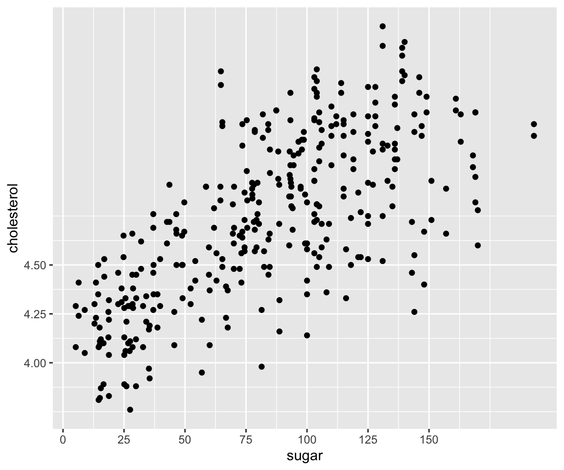
In this example, we have customized the breaks for sugar to be a equally-spaced sequence from 0 to 200 with increment 25, and the breaks for cholesterol to be another equally-spaced sequence from 4 to 5.5 with increment 0.25.
When the specified breaks do not cover the full range of the data, you will see the breaks changed but all the data points are still visible.
my_plot +
  scale_x_continuous(breaks = seq(from = 0, to = 150, by = 25)) +
  scale_y_continuous(breaks = seq(from = 4, to = 4.5, by = 0.25))
On the other hand, if the specified breaks go beyond the value of the data, ggplot() will only show the breaks values within the data range.
my_plot +
  scale_x_continuous(breaks = seq(from = 0, to = 300, by = 25)) +
  scale_y_continuous(breaks = seq(from = 4, to = 8, by = 0.25))
6.4.3 Zoom In to a Specific Region of the Data
Sometimes, you want to zoom in to the specific region of the data to see a finer detail. To do this, you can use the coord_cartesian() function with arguments xlim and ylim for specifying the desired region.
Let’s say we want to focus on the houses with sugar between 25 and 75.
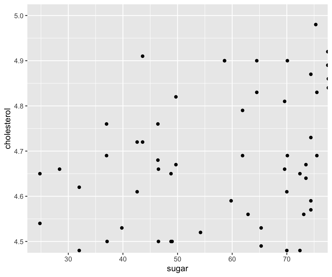
Let’s narrow down further to sugar between 25 and 75 and cholesterol between 4.5 to 5.0.
6.4.4 Generate Log-Scale Plot
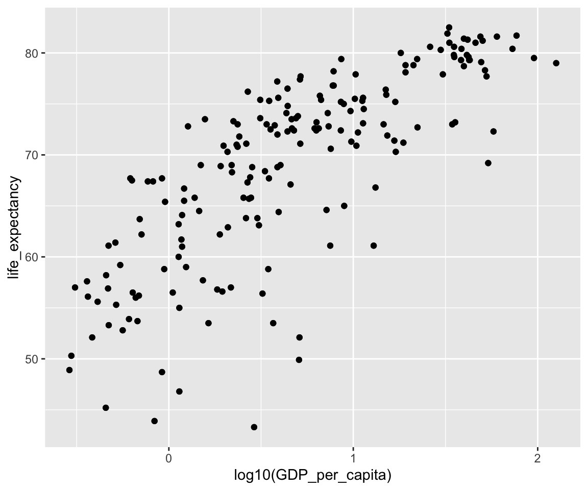
Recall that we generated the following scatterplot between GDP_per_capita and life_expectancy, where we took a logarithm transformation of GDP_per_capita.
For this particular log() transformation, an alternative is to generate a Log-scale Plot by setting the trans argument in the scale_y_continous() function. The log-scale plot is a popular way for displaying numerical data over a very wide range of values in a compact fashion.
The default value of trans is "identity", meaning no transformation. There are many different trans choices including log, exp, log10, sqrt, and others.
ggplot(data = gm2004) +
  geom_point(mapping = aes(x = GDP_per_capita,
                           y = life_expectancy)) +
  scale_x_continuous(trans = "log10")
Although the two figures look visually identical, the log-scale plot is often easier to interpret because the axis tick labels stay on the original scale of the variable (e.g., \(1{,}000\), \(10{,}000\), \(100{,}000\)) rather than showing transformed values (\(3\), \(4\), \(5\)). Readers can therefore map tick marks back to the real-world quantity without mentally undoing the logarithm.
6.4.5 Coordinate Flip
In some situations, you may want to flip the x and y coordinates. To do this, you just need to add coord_flip() to the existing ggplot. In a future section, we will see other type of transformation for coordinates.
6.4.6 Exercises
Use the sahp data set to answer the following questions.
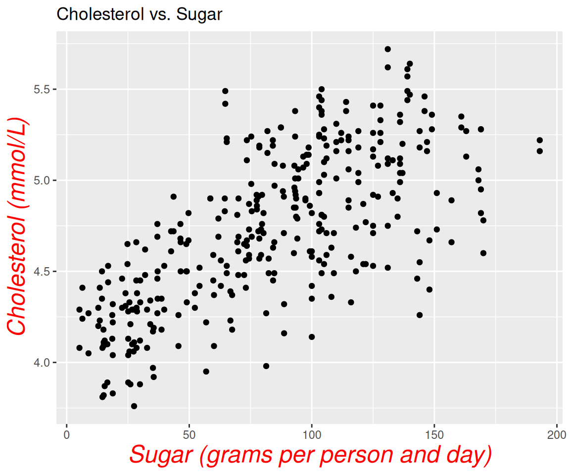
Create a scatterplot between
lot_area(x-axis) andsale_price(y-axis), with the breaks on the x-axis being an equally-spaced sequence from 0 to 40000 with increment 5000, and the breaks on the y-axis being (0, 200, 300, 550). And set the labels on the axes to be “Lot Area” and “Sale Price”, and the title to be “Sale Price vs. Lot Area”. Then, applymythemeto the plot.For the plot in Q1, create a zoom-in plot where
lot_areais between 10000 and 15000, andsale_priceis between 200 and 300.For the plot in Q1, create a corresponding log-log plot, where both the x-axis and y-axis are in log-scale.
