6.3 ggplot Aesthetics (II): Local Aesthetics Mapping
In Section 6.2, we introduced the first kind of aesthetics, namely Constant-Valued Aesthetics, where we set constant values to aesthetics that change features of the plot globally. In some applications, however, you may want to highlight different groups of the data with different values of aesthetics. In this section, we will dive deep into this topic: Local Aesthetics Mapping.
Believe it or not, we’ve already seen this kind of aesthetic mapping when we first introduced ggplot in Section 6.1.3.
library(ggplot2)
library(r02pro)
ggplot(data = gm2004) +
  geom_point(mapping = aes(x = sugar,
y = cholesterol)) 
In the aes() function, x and y can also be viewed as aesthetics. It is clear to see that we are not setting x and y as constants. Instead, we map the variable sugar to x and the variable cholesterol to y. The x and y coordinates control the location of each data points depending on the variables of sugar and cholesterol, which is the essence of scatterplot. Now, let’s see how to do local aesthetic mappings for color, size, shape, and so on.
6.3.1 Basic Local Aesthetics Mapping
a. Color
Let’s say you want to use different colors for male and female on the scatterplot. To do this, you can map the discrete variable gender to the color aesthetic by setting color = gender as an argument in the aes() function.
From this figure, we can clearly see that different genders are shown in distinct colors. Also, for the same value of sugar, it appears that the value of cholestrol could be a bit smaller for male than that for female. In addition, ggplot() automatically created a legend to show the correspondence between the genders and colors.
Can we map a continuous variable to the color aesthetic? The answer is positive.
Here, you can see that the color of the points changes smoothly according to the value of population, the details of which is shown in the legend. In particular, the darker points represent smaller populations while the lighter ones correspond to bigger populations.
b. Size
In addition to color, you can also map a discrete variable to the size aesthetic.
ggplot(data = gm2004) +
geom_point(mapping = aes(x = sugar,
y = cholesterol,
size = gender),
alpha = 0.5)
#> Warning: Using size for a discrete variable is not advised.
#> Warning: Removed 128 rows containing missing values or values outside the scale range
#> (`geom_point()`).
You can see from the plot that the sizes of the points are now different according to the gender.
To alleviate the overplotting issue, we added a contant-valued aesthetic alpha = 0.5 to the geom_point() function, making all points more transparent. Please pay close attention to the location where we put the argument:
- Contant-Valued Aesthetic: the aesthetic specification is put inside the
geom_point()function. - Local Aesthetics Mapping: the aesthetic mapping is put inside the
aes()function, which is itself an argument of thegeom_point()function.
There is a warning message: “Using size for a discrete variable is not advised.” The reason is that different sizes may implicitly indicate a particular ordering of the groups, which are usually not clear for a discrete variable.
Now, let’s try to map a continuous variable BMI to the size aesthetic.
ggplot(data = gm2004) +
geom_point(mapping = aes(x = sugar,
y = cholesterol,
size = BMI),
alpha = 0.5)
Note that now the size of the points changes according to the corresponding BMI value, i.e. the larger points represent higher BMIs values and the smaller ones correspond to lower BMI values. It is worth noting that the legend only shows three representative BMI values (20, 25, and 30) and their corresponding sizes, however, we have other sizes shown on the plot depending on exact BMI values.
c. Shape
We can also map a discrete variable to the shape aesthetic.
Now, the shape of the points are different for each continent.
Can we map a continuous variable to the shape aesthetic? Let’s try it out.
You will see an error message: “A continuous variable can not be mapped to shape”. This is because shape is of a discrete nature in the sense that different shapes have no natural ordering and the number of possible shapes is finite where the continuous variable could take infinitely many different values.
d. Multiple Aesthetic Mappings
Just like Constant Valued Aesthetics, you can have multiple aesthetic mappings in ggplot, which can involve multiple mapped variables.
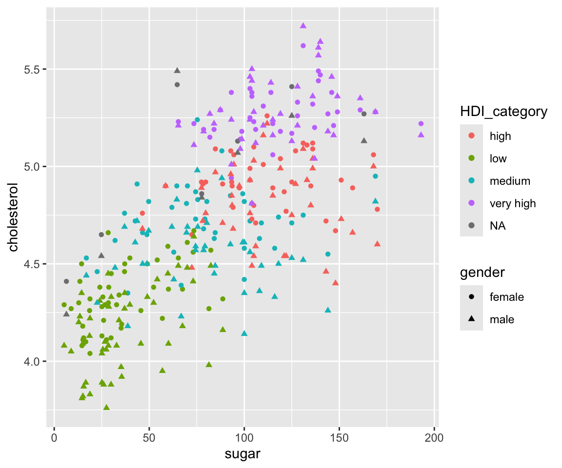
ggplot(data = gm2004) +
geom_point(mapping = aes(x = sugar,
y = cholesterol,
shape = gender,
color = HDI_category))
Here, we differentiate gender by different shapes and differentiate HDI_category by different colors. Note that HDI_category represent the Human Development Index for each country. We can see that countries with low HDI has smaller values of sugar and cholesterol in general. Also note that there are two legends on the plot showing the color and shape, respectively.
6.3.2 Customize the Local Aesthetics Mapping
So far, we have introduced the basic local aesthetics mapping, where the default aesthetic values are used. Sometimes, you may want to use specific aesthetic values (colors, shapes) for particular values of the mapped variable.
a. Customize colors for discrete variables
Let’s start with the color aesthetic. To customize the colors with discrete variable, you can add a layer to the ggplot with function scale_colour_manual with argument values containing a character vector consisting of the desired colors in order.
ggplot(data = gm2004) +
  geom_point(mapping = aes(x = sugar,
                           y = cholesterol,
color = gender)) +
scale_colour_manual(values = c("orange","purple"))
Now, the female group has color orange and the male group has color purple.
b. Remove the NA level
Let’s try to map continent to color.
The plot shows us the Africa countries in general have a lower value of sugar as well as a small value of cholestrol. On the other hand, the American and European countries have large values of sugar and cholestrol.
You may noticed that this is a level NA for the continent due to missing values. To address this issue, you can use the remove_missing() function to remove observations with a missing value of continent.
ggplot(data = remove_missing(gm2004, vars = "continent")) +
  geom_point(mapping = aes(x = sugar,
                           y = cholesterol,
                           color = continent))
Now, only the five continents are displayed.
Note that here, we add the argument vars = "continent" in the remove_missing() function. This works by removing the observations only if the continent variable is missing. Without such an argument, an observation will be removed as long as there is at least one variable missing. For a dataset like gm2004 that contain many variables, we recommend explicitly specify the variables that need to be considered for missingness. Here, the vars can take the value of a character vector, containing all variables that you want to consider for missingness.
c. Customize color for continuous variables
To customize the color for continuous variables, you can add a layer scale_color_continuous() which specify the lower-value color and the high-value color for the variable.
ggplot(data = gm2004) +
  geom_point(mapping = aes(x = sugar,
                           y = cholesterol,
                           color = BMI)) +
  scale_color_continuous(low = "green",
                         high = "red")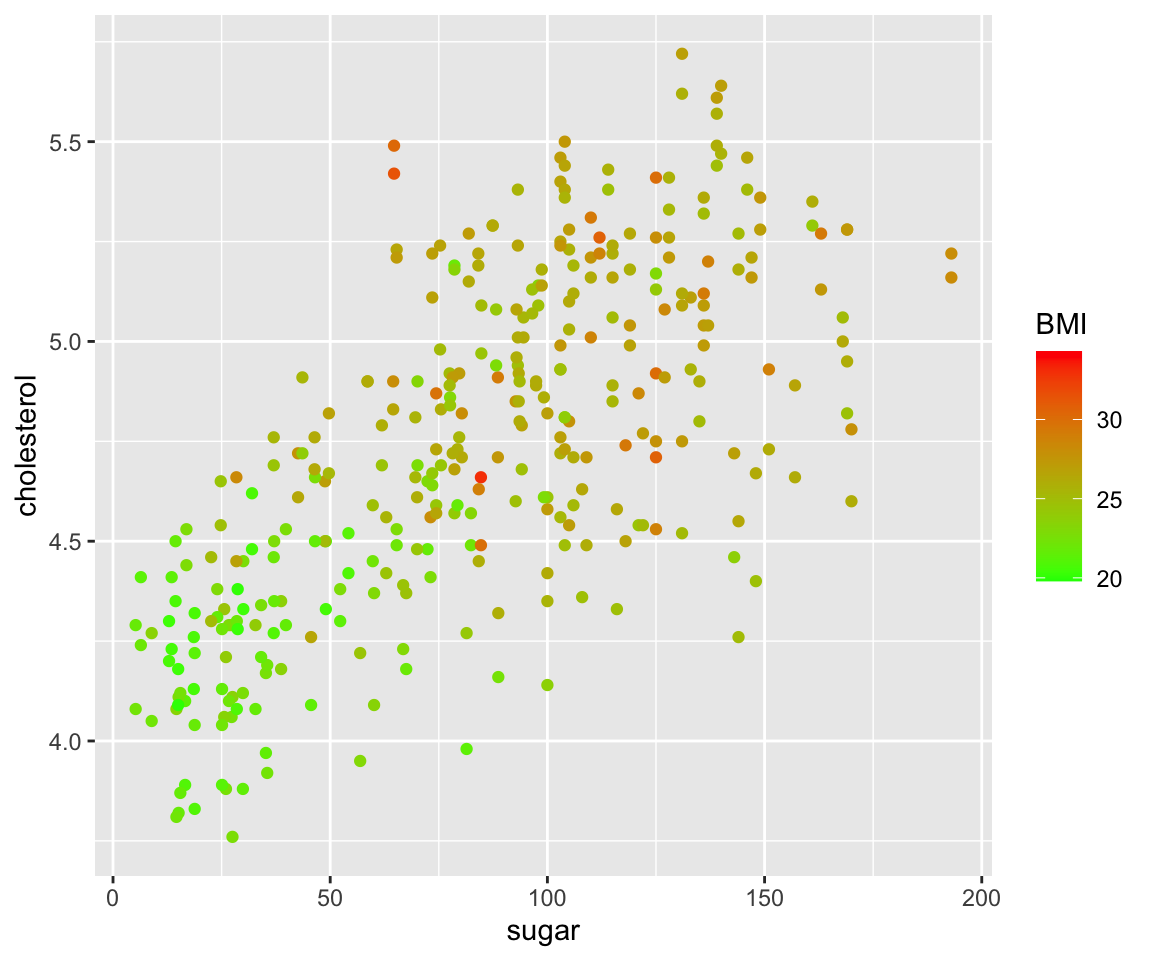
Now, we mapped the BMI to the color aesthetic and the lower values of BMI are mapped to green while the higher values are mapped to red.
d. Customize the shape for discrete variables
Similarly, you can also customize the shapes for each level of the discrete variable.
ggplot(data = gm2004) +
  geom_point(mapping = aes(x = sugar,
                           y = cholesterol,
                           shape = gender)) +
  scale_shape_manual(values = c(6, 3))
Here, we have the female and male being mapped to shape 6 and 3, respectively. Recall that all possible shapes are shown in Figure 6.1.
6.3.3 Customize the legend order for discrete variables
Let’s review the following plot where we map continent to the color aesthetic.
ggplot(data = remove_missing(gm2004, vars = "continent")) +
  geom_point(mapping = aes(x = sugar,
                           y = cholesterol,
                           color = continent))
Looking at the legend, you can see that different continent values are in alphabetical order as introduced in Section 3.5 when you learned the ordering of character vectors. Sometimes, you may want to arrange these values in a different order in the plot. To achieve this, you can add a layers scale_color_discrete() with the argument breaks that specifies the desired order on the legend.
ggplot(data = remove_missing(gm2004, vars = "continent")) +
  geom_point(mapping = aes(x = sugar,
                           y = cholesterol,
                           color = continent))  +
  scale_color_discrete(breaks = c("Oceania", "Europe", "Asia", "Americas","Africa"))
Note that only the legend order changed with the corresponding mapped values unchanges.
Now, let’s map gender to the shape aesthetic.
To customize the legend order, you can add another layers called scale_shape_discrete() with the desired legend order.
ggplot(data = gm2004) +
  geom_point(mapping = aes(x = sugar,
                           y = cholesterol,
shape = gender)) +
scale_shape_discrete(breaks = c("male", "female"))
You may find a pattern here that to customize a ggplot where a certain aesthetic is considered, we need to use the corresponding customization function like scale_color_discrete() for the color aesthetic and scale_shape_discrete() for the shape aesthetic.
6.3.4 Create Logical Variables and Map to Aesthetics
Lastly, you can also create logical variables on the fly and map them to aesthetics, without defining them as new variables. For example, if you want to differentiate the points according to whether the value of BMI is larger than 25, a logical variable BMI > 25 can be created.
ggplot(data = gm2004) +
  geom_point(mapping = aes(x = sugar,
                           y = cholesterol,
                           color = BMI > 25),
             size = 2)
Now, let’s see another example where we want to differentiate countries in Africa vs. other continents.
ggplot(data = gm2004) +
  geom_point(mapping = aes(x = sugar,
                           y = cholesterol,
                           shape = continent != "Africa"),
             size = 2)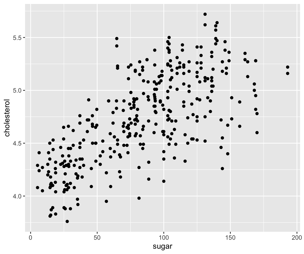
Clearly, you can easily create new logical variables using any logical operations on existing variables, and map them into any aesthetics just like for the existing categorical variables.
6.3.5 Exercises
Use ggplot2 package to answer the following questions.
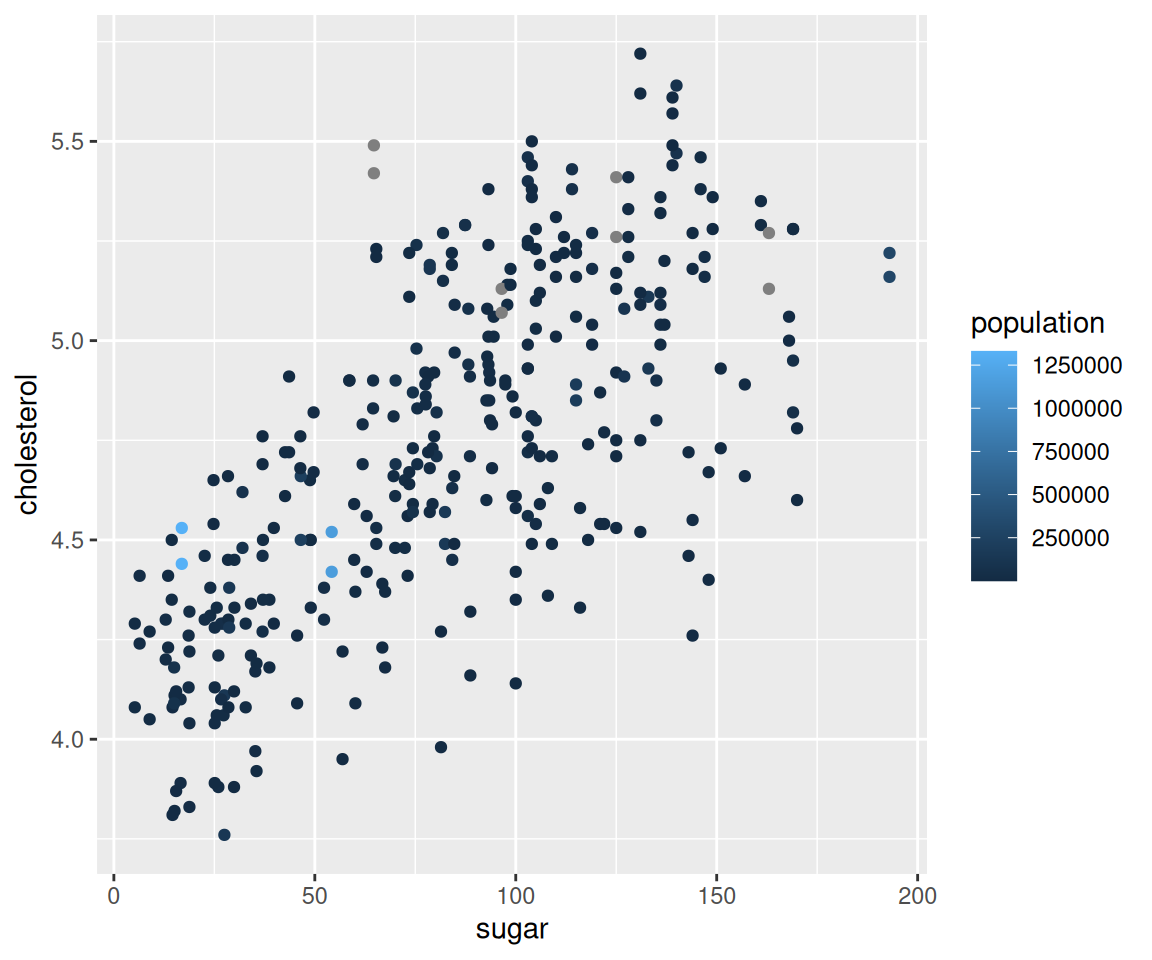
Using the
sahpdataset, create a scatterplot to visualize the relationship betweenliv_area(on the x-axis) andsale_price(on the y-axis). Use different colors for differenthouse_style, different shapes to distinguishcentral_air, and points are of the size 2.Using the
gm2004dataset, create a scatterplot to visualize the relationship betweenBMI(on the x-axis) andcholesterol(on the y-axis) where the points are purple and the size of the points are determined by theBMIvalues.Using the
gm2004dataset, create a scatterplot to visualize the relationship betweensugar(on the x-axis) andcholesterol(on the y-axis) where the points are red whenHDI_categoryis high or very high and the points are purple whenHDI_categoryis low or medium and the size depend on the value ofpopulation. Please also remove theNAlevel inHDI_category. Discuss your findings.
