6.9 Histograms
In Section 6.8, we learned how to use geom_bar() to generate bar charts for visualizing the distributions of discrete variables. You may be wondering, how about visualizing continuous variables? One popular plot is called histograms.
In this section, we will return to the gm2004 data set.
6.9.1 Using the hist() function
To generate a histogram, you can simply use hist() with the variable as the argument.
On the x-axis, the histogram displays the range of values for the cholesterol value. Then, the histogram divides the x-axis into bins with equal width, and a bar is erected over the bin with the y-axis showing the corresponding number of observations (called Frequency on the y-axis label).
6.9.2 Using the geom_histogram() function
In addition to using the hist() function in base R. The geom_histogram() function in the ggplot2 package provides richer functionality. Let’s take a quick look.
library(ggplot2)
ggplot(data = gm2004) +
  geom_histogram(mapping = aes(x = cholesterol))
#> `stat_bin()` using `bins = 30`. Pick better value `binwidth`.
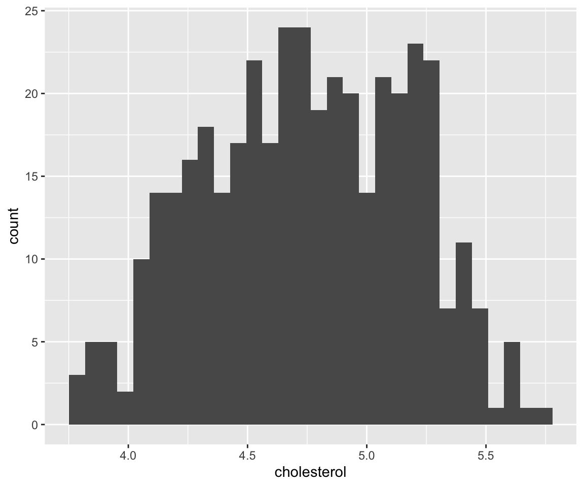
We could see a message, saying “stat_bin() using bins = 30” which implies the histogram has 30 bins by default. Next, we introduce three different ways to customize the bins.
a. Use Aesthetic bins.
We can change the number of bins with the constant-valued aesthetic bins.
We can see that the histogram now has 5 bins and each bin has the same width.
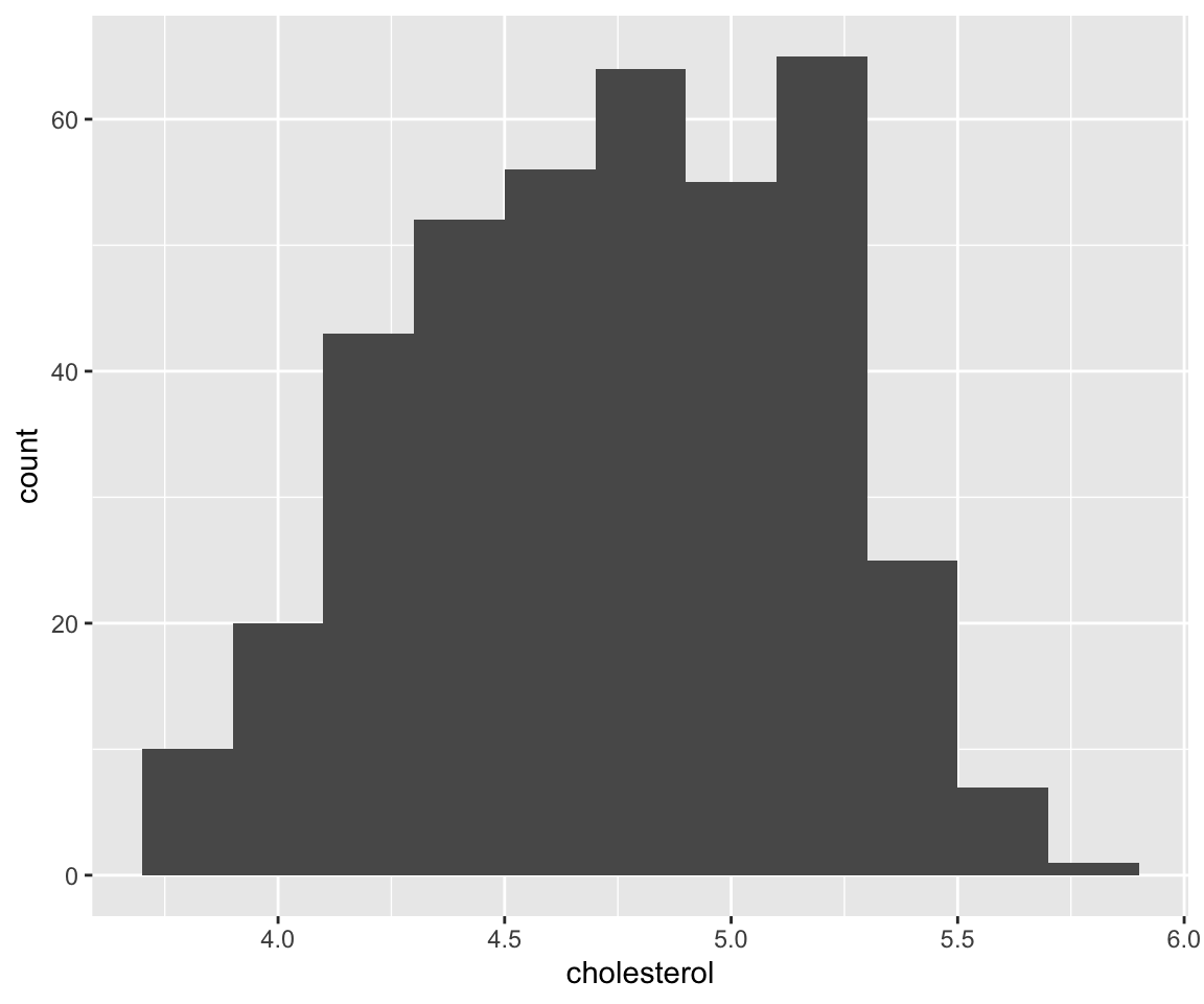
b. Use Aesthetic binwidth.
And from the message, another way to change the number of bins is to specify the binwidth, which is another constant-valued aesthetic.
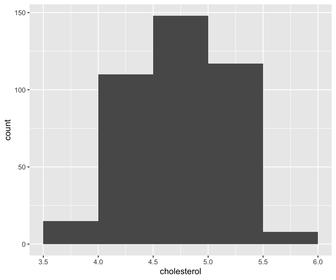
c. Manually Set the Bins.
If desired, you can manually set the bins via the breaks argument in the geom_histogram() function.
ggplot(data = gm2004) +
  geom_histogram(mapping = aes(x = cholesterol),
                 breaks = seq(from = 3.5,
                              to = 6,
                              by = 0.5))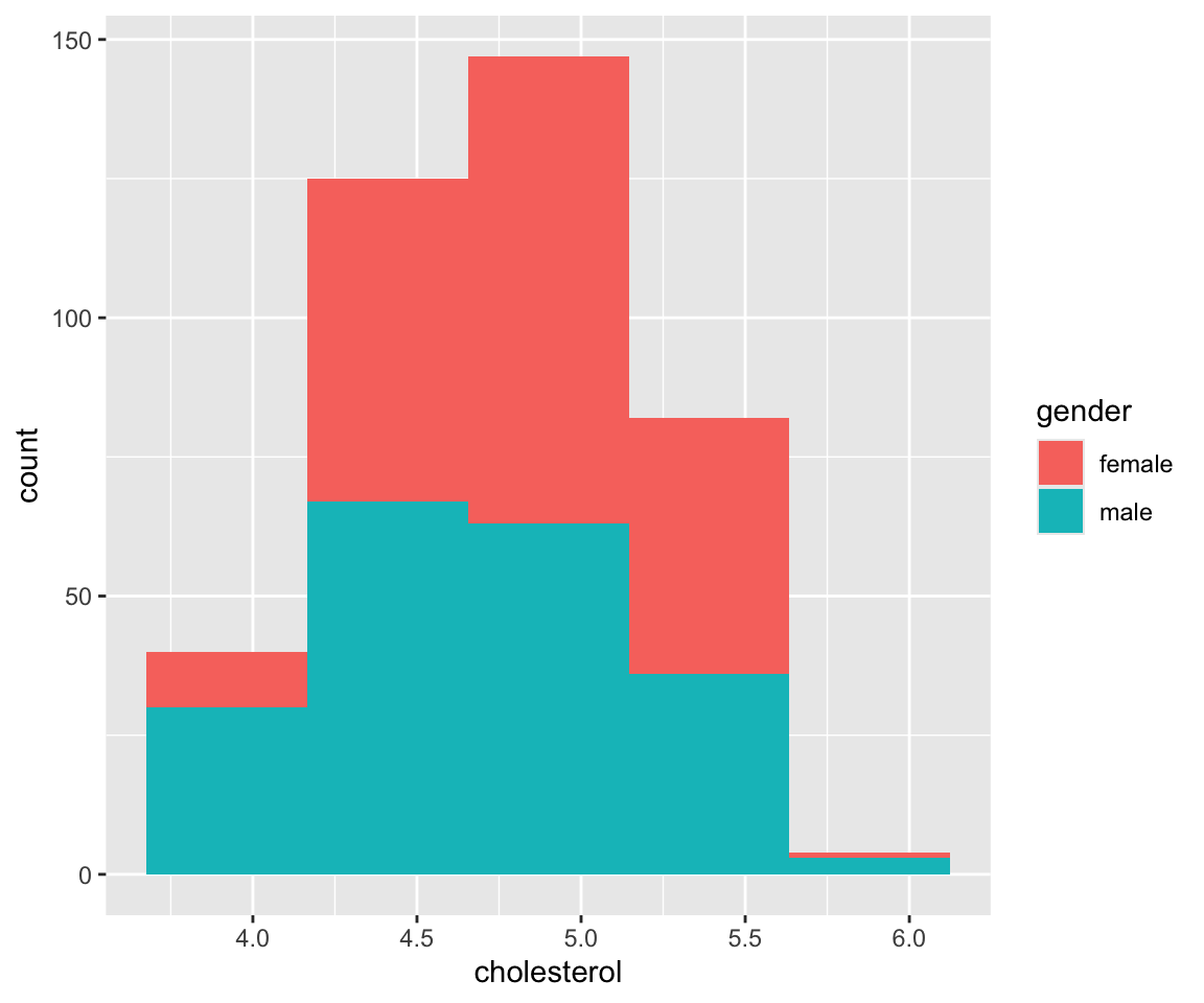
The breaks argument is a numeric vector specifying how the bins are constructed. Let’s verify the height of the first bin.
The number matches to the height of the first bin. Not that we need to add na.rm = TRUE as an argument since there are missing values.
6.9.3 Aesthetics in geom_histogram()
Next, we introduce the aesthetics in histograms, which are very similar to those in bar charts. For example, we can map a variable to the fill aesthetic.
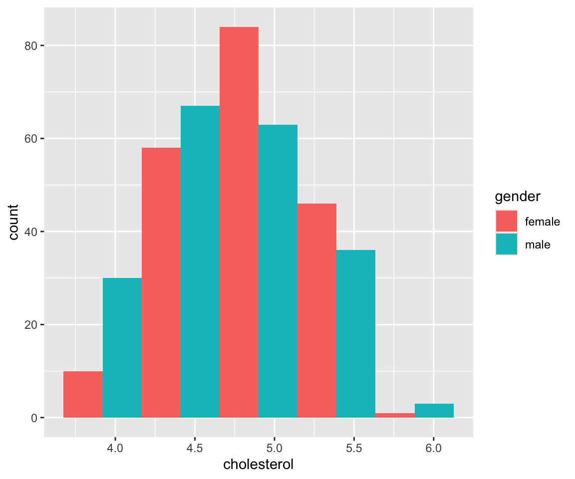
We can see that like the bar chart, the bar for each bin is now divided into sub-bars with different colors. The different colors in each sub-bar correspond to the values of gender. And the height of each sub-bar represents the count for the cases with the cholesterol in this particular bin and the specific value of gender. We observe that while the male and female group behave similarly in the middle bins, many more countries has a small mean cholesterol value for males than those for females.
Just like geom_bar(), we have a global aesthetic called position, which does position adjustment for different sub-bars. The default position value is again "stack" if you don’t specify it.
a. Stacked Bars
ggplot(data = gm2004) +
  geom_histogram(mapping = aes(x = cholesterol,
                               fill = gender),
                 position = "stack",
                 bins = 5)
As expected, we get the same histogram as before.
b. Dodged Bars
The second option for position is "dodge", which places the sub-bars beside one another, making it easier to compare individual counts for the combination of a bin of cholesterol and gender.
ggplot(data = gm2004) +
  geom_histogram(mapping = aes(x = cholesterol,
                               fill = gender),
                 position = "dodge",
                 bins = 5)
c. Filled Bars
Another option for optional is position = "fill". It works like stacking, but makes each set of stacked bars the same height.
ggplot(data = gm2004) +
  geom_histogram(mapping = aes(x = cholesterol,
                               fill = gender),
                 position = "fill",
                 breaks = seq(from = 3.5,
                              to = 6,
                              by = 0.5))
Just like geom_bar(), the y axis may be labeled as “proportion” rather than “count”, to be more precise. This makes it easier to compare proportions of different values of gender for different bins of cholesterol. For example, we can see that the proportion of gender = "male" is 100% for cholesterol values smaller than 4.
6.9.4 Density Estimate Using Histograms
In addition to using histograms to visualize the distribution of a discrete variable, you can also construct a density density of variable using a proper normalization. To generate such a density estimate, you can add y = ..density.. as a mapping in the aes() function in geom_historgram(). Let’s see an example as below.
ggplot(data = gm2004) +
geom_histogram(mapping = aes(x = cholesterol,
y = ..density..),
breaks = seq(from = 3.5,
to = 6,
by = 0.5))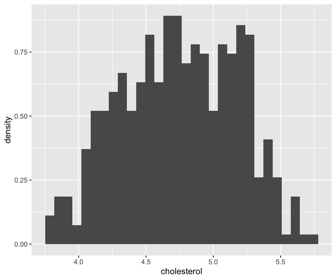 Let’s try to calculate the height of the first bar together. We know that the total area of the bars is 1, agreeing with the definition of density. First, we get the area of the first bar. Then we divide it by the width to get the height.
cholesterol_no_na <- na.omit(gm2004$cholesterol)
sum(cholesterol_no_na < 4)/length(cholesterol_no_na) #area of the first bar
#> [1] 0.03768844
sum(cholesterol_no_na < 4)/length(cholesterol_no_na) /0.5 #height of the first bar
#> [1] 0.07537688
You can see that the height matches the y axis for the first bar.
6.9.5 Exercises
Use the sahp data set to answer the following questions.
- Create three different histograms on the living area (
liv_area) for each of the following settings
- Use 10 bins
- Set the binwidth to be 300
- Set the bins manually to an equally-spaced sequence from 0 to 3500 with increment 500.
- Create histograms on the living area (
liv_area) with 5 bins, and show the information of differentkit_qualvalues in each bar. What conclusions can you draw from this plot?
