6.5 Line Plots
In this section, we will introduce the line plot, which is very useful for visualizing trends and often used in time series.
Let’s work on the sahp dataset, where we would like to study the trend of the sale price as a function of the sold date of the house.
6.5.1 Line Plots via plot()
To generate a line plot, you can use the plot() function by setting the argument type = "l".
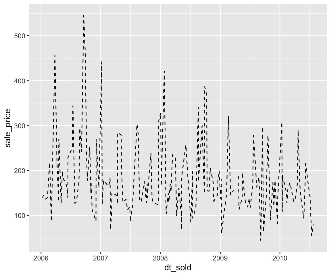
Wow, this doesn’t look pretty at all. The reason that we get such a chaotic plot is due to the working mechanism of plot(). The plot() works by first getting the location of the value pairs of dt_sold and sale_price. Then, connect the points in the order of the observations.
As a result, before calling the plot() function, you need to first sort the observations (in Section 3.2) according to the variable on the x-axis, which is dt_sold in this example.
dt_sold_order <- order(sahp$dt_sold)
plot(sahp$dt_sold[dt_sold_order],
     sahp$sale_price[dt_sold_order],
     type = "l",
     xlab = "Date Sold",
     ylab = "Sale Price")
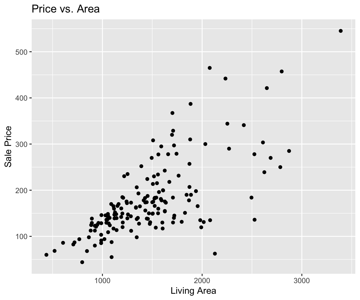
Note that here we added the labels for the x and y axes like we did for scatterplots.
In the line plots, we would like to introduce two additional graphical parameters that we can customize in the plot() function.
| Parameter | Meaning | Example |
|---|---|---|
lty |
The line type | “dashed” |
lwd |
The line width | 2 |
The line type can be either a integer from 0 to 6 or the corresponding character string, which is summarize in the following figure.
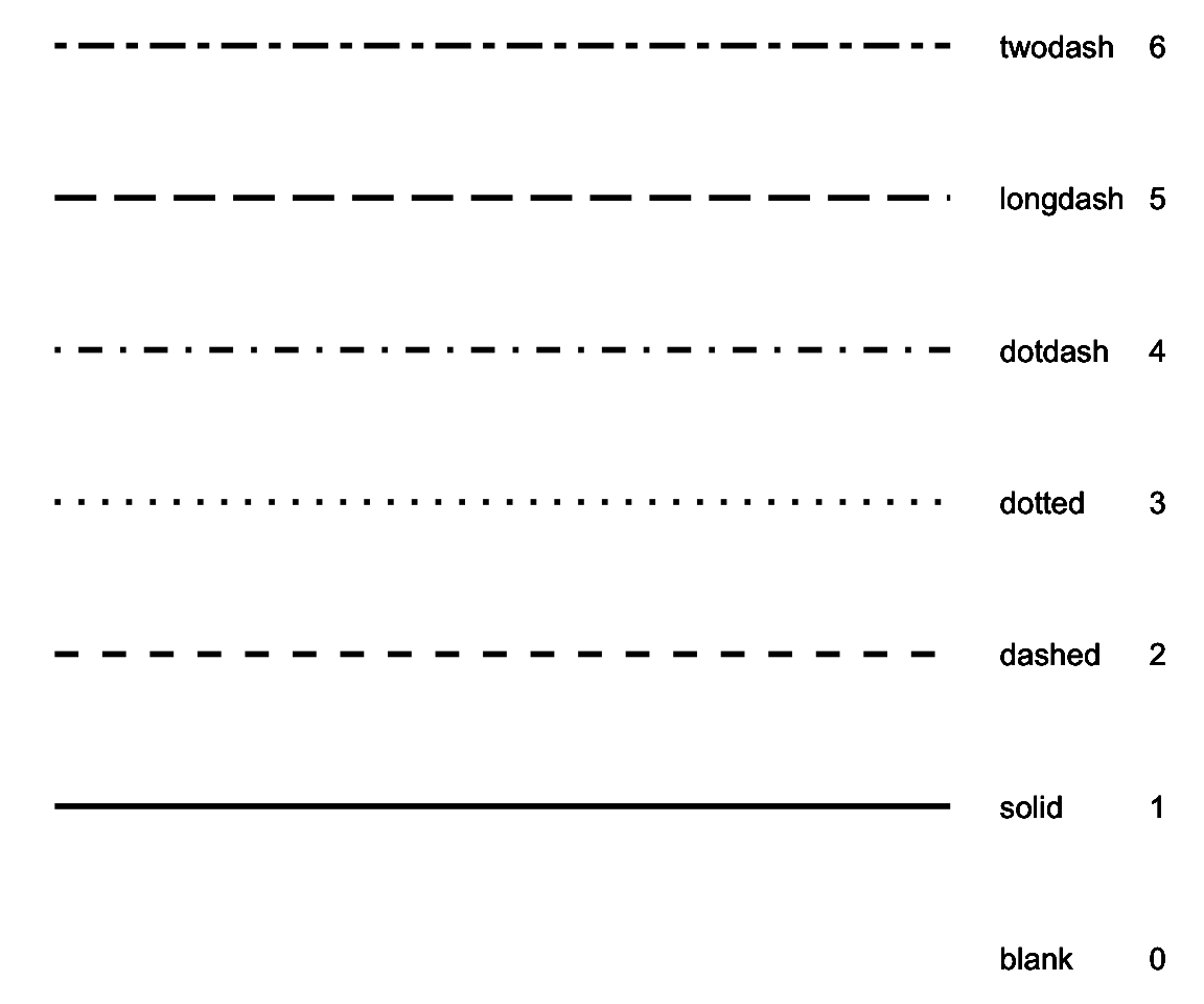
Figure 6.3: All Possible Line Types
Let’s see an example with the two parameters.
plot(sahp$dt_sold[dt_sold_order],
     sahp$sale_price[dt_sold_order],
     type = "l",
     xlab = "Date Sold",
     ylab = "Sale Price",
     lty = 2,
     lwd = 2)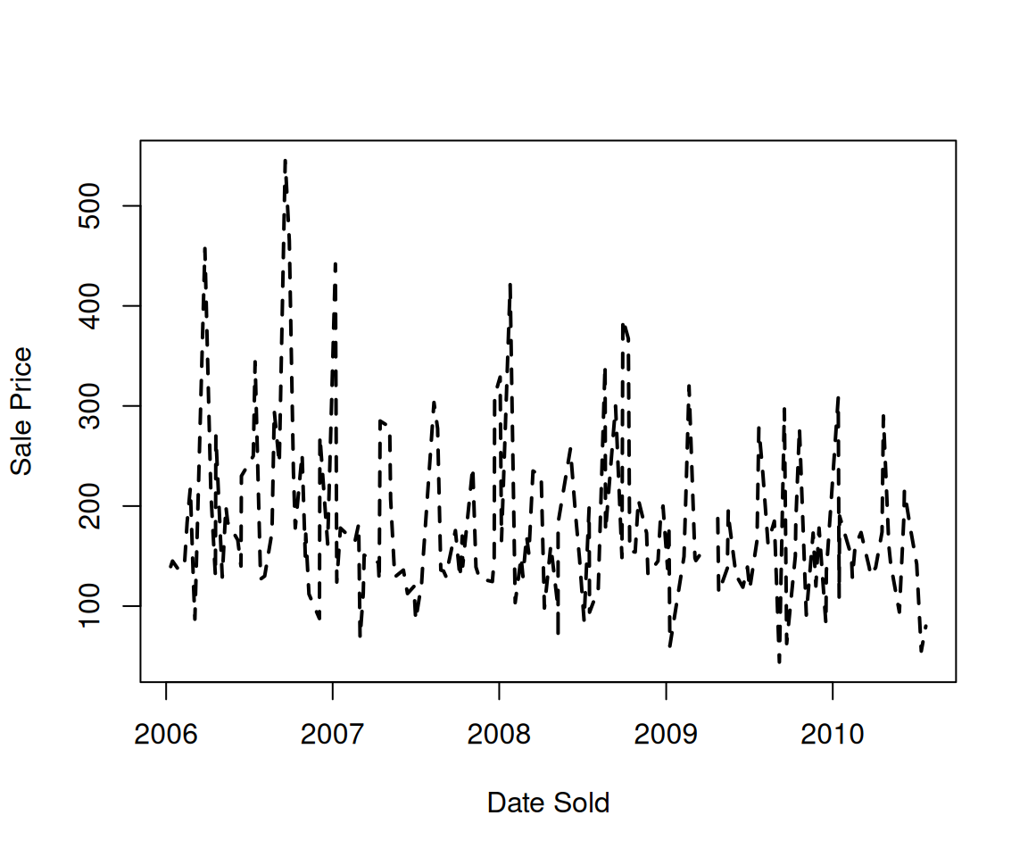
The plot() function also offers the capability to show the points and line on the same plot by changing type = "b".
plot(sahp$dt_sold[dt_sold_order],
     sahp$sale_price[dt_sold_order],
     type = "b",
     xlab = "Date Sold",
     ylab = "Sale Price")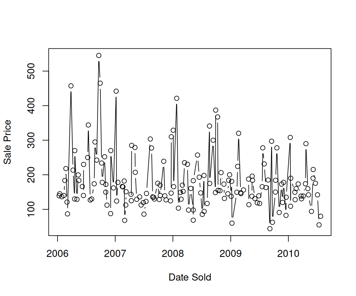
6.5.2 Line Plots via geom_line()
In addition to the plot() function in base R, we can use the geom_line() function in the ggplot family.
The generated line plot looks essentially the same as that generated by plot(). It is worth noting that here, the points are connected not by the order of the observations, but by the values of the variable on the x-axis, i.e. dt_sold, which avoids the need to sort the observations by the x-axis.
6.5.3 Constant-Valued Aesthetics in Line Plots
Like in Scatterplots, you can also set Constant-Valued Aesthetics (see Section 6.2) in line plots.
a. Color
We can change the color of the line by setting the color aesthetic to a constant value.
b. Line Type
One useful aesthetic in geom_line() that was not applicable in geom_point() is linetype, which controls the line type. The collection of different line types is available in Figure 6.3.
c. Size
Similar to scatterplots, you can also set the size aesthetic in a line plot. While the size controls the size of the points in a scatterplot, the size aesthetic controls the width of the line.
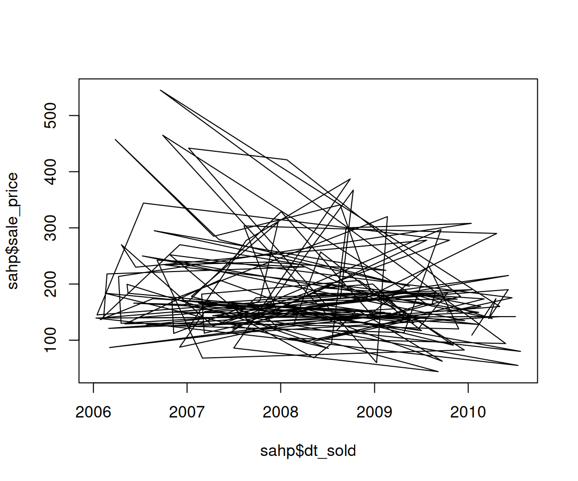
6.5.4 Mapping Variables to Aesthetics in Line Plots
In addition to constant-valued aesthetics, you can also Map Variables to Aesthetics (see Section 6.3) in line plots to highlight different groups.
a. Color
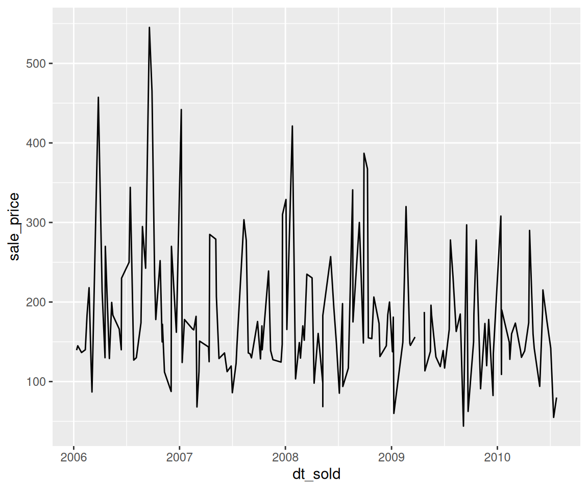
Here, the observations are divided into groups according to the value of kit_qual and separate line plots are generated for each group, represented by different colors.
b. Line Type
Similarly, we can also map variables to the linetype aesthetic, which uses different line types for each group.
6.5.5 Exercises
First, create a data set sahp_2006 by running the following code
Then, use sahp_2006 to answer the following questions.
Using
plot()to create a line plot ofdt_sold(on the x-axis) andsale_price(on the y-axis) to show the trend of the sale price as a function of the sold date of the house, then give title “DS” for the x-axis and title “SP” for the y-axis and make the line to be a “twodash” line.Using the ggplot2 package to create a line plot of
dt_sold(on the x-axis) andsale_price(on the y-axis) with different linetypes depending on the value ofhouse_style.
