7.5 Error Bars
So far, we have learned several ways to compare continuous distributions for different groups, including the density plot, boxplot, and the violin plot. In this lesson, we introduce another visualization method, called error bar, which is a graphical representations of the uncertainty in a certain measurement. Let’s prepare a ggplot object to get started.
library(r02pro)
library(ggplot2)
g <- ggplot(data = sahp,
            aes(x = house_style,
                y = sale_price)) +
  scale_x_discrete(limits=c("1Story",
                            "2Story"))
Here, we visualize the error bar as the mean \(\pm\) standard error.
To show the mean of sale_price for different house_style groups, you can use the geom_point() function with arguments stat = "summary" and fun = "mean".

To add error bars to the mean points, we use geom_errorbar() coupled with the fun.data = "mean_se" argument.
g  + geom_point(stat = "summary",
fun = "mean") +
geom_errorbar(stat = "summary",
fun.data = "mean_se") 
You can control the width of the errorbar by setting the width argument.
g + geom_point(stat = "summary",
                fun = "mean") +
  geom_errorbar(stat = "summary",
                fun.data = "mean_se",
                width = 0.2)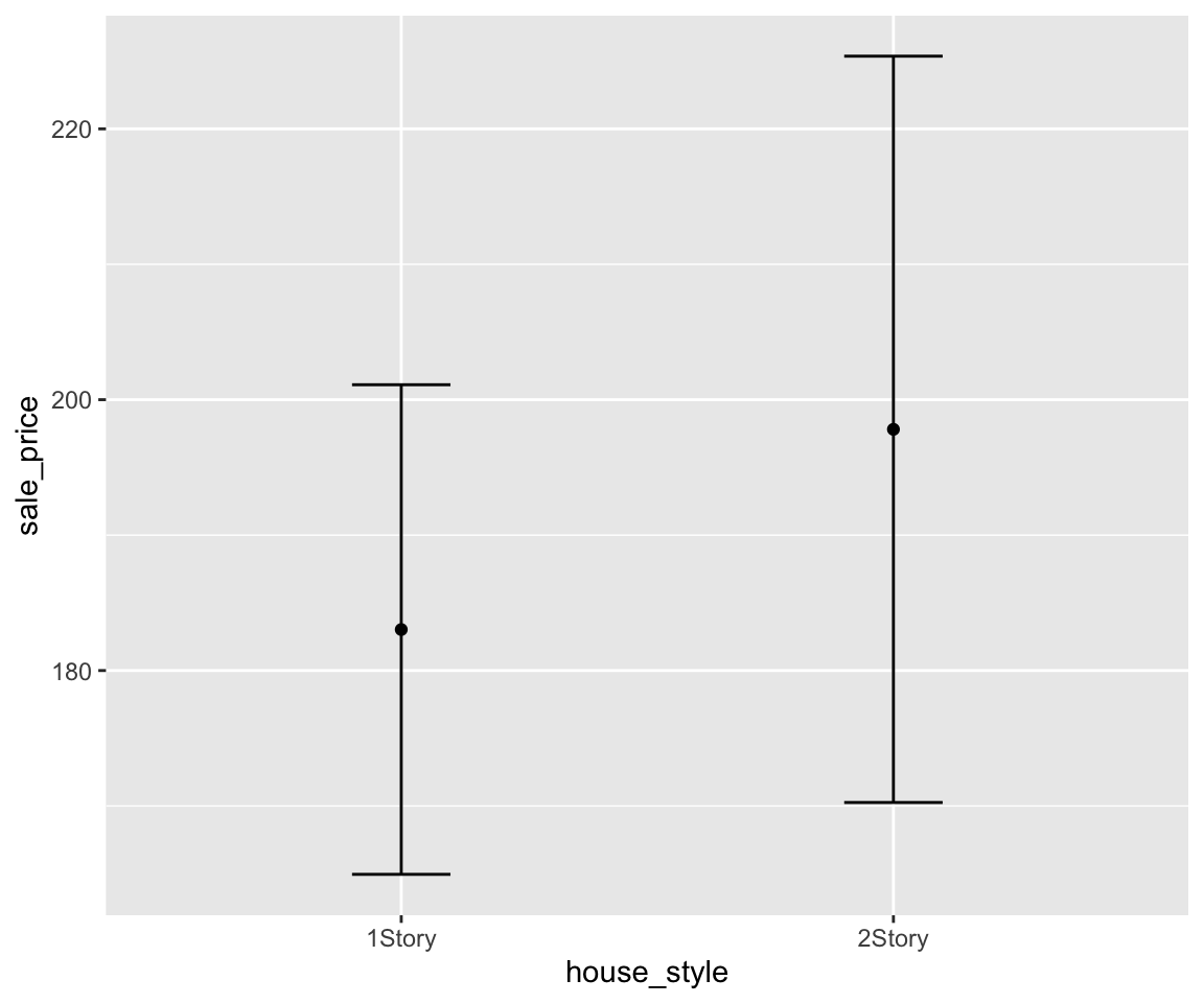
This plot is called a mean-error-bar plot. Let’s take a detailed look at this plot. The distance from the mean point to the lower bound of the error bar is the so called standard error, which is defined as the standard deviation of the sample divided by the square root of the sample size. Let’s try to calculate the upper and lower bounds of the error bar.
sale_price_1_story <- sahp$sale_price[sahp$house_style == "1Story"]
sale_price_1_story_se <- sd(sale_price_1_story)/sqrt(length(sale_price_1_story))
mean(sale_price_1_story) + sale_price_1_story_se
#> [1] 192.251
mean(sale_price_1_story) - sale_price_1_story_se
#> [1] 173.8044
You may notice that we are referring the data as sample since the sahp dataset contains only a subset of the population with all houses in the world. An important application of error bar is to construct the 95% confidence interval of the population mean. You know that the 95% confidence interval for a normal distribution is mean \(\pm\) 1.96*se. If the data follows a normal distribution, you can construct such a confidence interval by setting the multiplier of the standard error in the error bar to be 1.96.
g + geom_point(stat = "summary",
                fun = "mean") +
  geom_errorbar(stat = "summary",
                fun.data = "mean_se",
                width = 0.2,
                fun.args = list(mult = 1.96))
Of course, you can also add the error bar on top of the other plots like the boxplot or violin plot.
g  + geom_point(stat = "summary",
                fun = "mean") +
  geom_boxplot() +
  geom_errorbar(stat = "summary",
                fun.data = "mean_se",
                width = 0.2)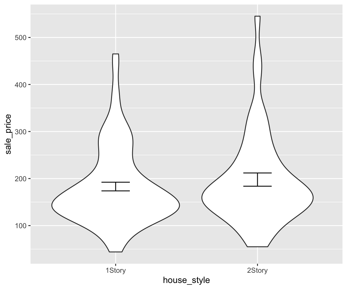
g  + geom_point(stat = "summary",
                fun = "mean") +
  geom_violin() +
  geom_errorbar(stat = "summary",
                fun.data = "mean_se",
                width = 0.2)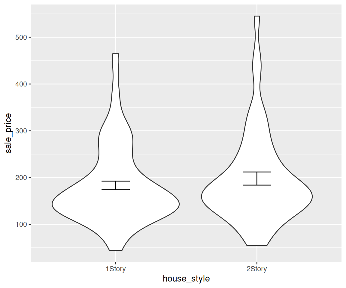
In this section, we introduced the error bar plot, which visualizes the uncertainty in a measurement. The standard error bar shows the mean \(\pm\) one standard error, while a 95% confidence interval uses a multiplier of 1.96. Error bars can be overlaid on top of boxplots or violin plots to combine distribution information with uncertainty measures.
7.5.1 Exercises
Using the
gm2004dataset from the r02pro package, create a mean-error-bar plot forcholesterolgrouped bycontinent, restricting to"Africa","Americas", and"Europe". Set the error bar width to 0.3.Modify the plot from Exercise 1 to show a 95% confidence interval by setting
fun.args = list(mult = 1.96)ingeom_errorbar().Using the
sahpdataset, create a mean-error-bar plot forsale_pricegrouped byhouse_style(restricting to"1Story"and"2Story"), and overlay a boxplot underneath the error bars.Manually verify the error bar bounds for the
"Africa"group in Exercise 1 by computing the mean and standard error ofcholesterolfor African countries.
