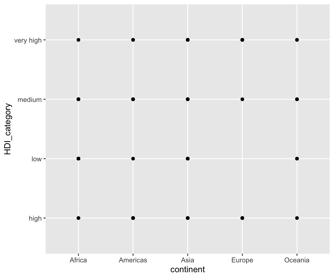
6.13 Review of Basic Visualization
In this chapter, we have introduced the most commonly used plots for visualization. It is helpful to review what we have learned so far.
6.13.1 Summary of geoms
| Names | Funs | Section |
|---|---|---|
One continuous variable (e.g. cholesterol or sale_price)
|
||
| Histogram |
geom_histogram(aes(x = cholesterol))
|
6.9 |
| Density Plot |
geom_density(aes(x = cholesterol))
|
6.10 |
| Boxplot |
geom_boxplot(aes(x = "", y = sale_price))
|
6.11 |
One discrete variable (e.g. kit_qual)
|
||
| Bar Chart |
geom_bar(mapping = aes(x = kit_qual))
|
6.8.1 |
| Pie Chart |
geom_bar(aes(x = kit_qual), stat = "identity") + coord_polar("y")
|
6.8.4 |
Two continuous variables (e.g. sugar and cholesterol)
|
||
| Scatterplot |
geom_point(mapping = aes(x = sugar, y = cholesterol))
|
6.1 |
| Line Plot |
geom_line(mapping = aes(x = dt_sold, y = sale_price))
|
6.5 |
| Smoothline |
geom_smooth(mapping = aes(x = sugar, y = cholesterol))
|
6.6 |
Two discrete variables (e.g. kit_qual and central_air):
|
||
| Bar Chart |
geom_bar(mapping = aes(x = kit_qual, fill = central_air))
|
6.8.3 |
One continuous variable and one discrete variable (e.g. kit_qual and sale_price):
|
||
| Boxplot |
geom_boxplot(aes(x = kit_qual, y = sale_price))
|
6.11.3 |
6.13.2 The grammatical structure of ggplot()
Next, we review the grammatical structure of ggplot().
| Code | Info |
|---|---|
ggplot(data = <DATA>) + |
data to be used |
<GEOM_FUNCTION>( |
geom for generating the desirable plot |
mapping = aes(<MAPPINGS>), |
aesthetic mappings, this may include the x and y axes and other features like color, shape, fill, linetype, size, etc. |
stat = <STAT>, |
statistical transformation, for example, when we create the errorbar |
position = <POSITION>) + |
position, like stack, dodge, fill |
<COORDINATE_FUNCTION> + |
such as flipping the x and y axes |
<FACET_FUNCTION> + |
facet_wrap() and facet_grid(), create multiple plots for different subsets of the data |
<SCALE_FUNCTION> + |
customize the x and y breaks |
<THEME_FUNCTION> |
customize labels, title, and fonts |
6.13.3 A complex ggplot() example
To conclude this chapter, let’s look at an example with all components.
library(r02pro)
library(tidyverse)
ggplot(data = na.omit(sahp)) +
  geom_bar(
    mapping = aes(x = kit_qual, fill = oa_qual > 5),
    stat = "count",
    position = "fill") +
  coord_flip() +
  facet_wrap(vars(house_style)) +
  scale_y_continuous(breaks = seq(from = 0, to = 1, by = 0.2)) +
  theme(plot.title = element_text(size = 24, color = "magenta")) +
        xlab("Kitchen quality") +
  ylab("Proportion") +
  ggtitle('A bar chart in proportion of kitchen quality')
This plot shows a bar chart using the data sahp for the variable kit_qual, map the variable oa_qual > 5 to the fill aesthetic and with fill position, with the x and y coordinates flipped, faceted using the variable house_style, and with the breaks on the y axis, the title and its font, the label on the y axis being customized.
6.13.4 Exercises
Using the
gm2004dataset from the r02pro package, create a scatterplot ofsugar(x-axis) vs.cholesterol(y-axis), colored bycontinent, with a smoothing line added viageom_smooth(). Customize the axis labels and add a title.Using the
sahpdataset, create a faceted histogram ofsale_pricewith one panel perhouse_style(restrict to"1Story"and"2Story"). Customize the number of bins to 15.Recreate the complex example plot above, but replace
kit_qualwithhouse_styleand facet bykit_qualinstead. Add appropriate axis labels and a title.
