7.3 Line Segments
It is sometimes helpful to add line segments as auxiliary lines to existing plots to provide additional information.
7.3.1 Using abline() with plot()
Let’s first review the scatterplot between liv_area and sale_price.
In this plot, you may want to add some auxiliary lines. You can use the function abline() after a call of plot() to do this. To add a vertical line, you can set the parameter v; to add a horizontal line, you can set the parameter h.
plot(sahp$liv_area, sahp$sale_price)
abline(v = 2000, col = "purple")       ##Add a vertical line at liv_area = 2000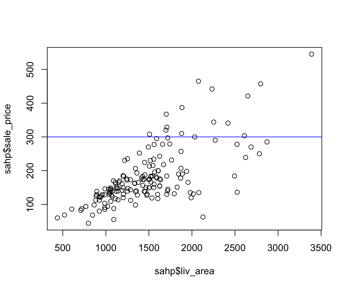
plot(sahp$liv_area, sahp$sale_price)
abline(h = 300, col = "blue")         ##Add a horizontal line at sale_price = 2000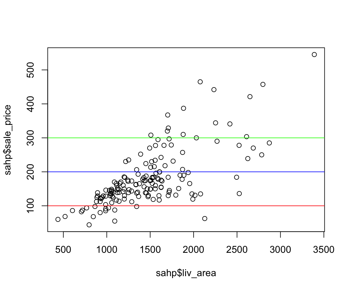
Note that the v and h arguments can also be vectors with more than one values, which will lead to multiple vertical or horizontal lines. The corresponding argument col can also be a vector with multiple values.
plot(sahp$liv_area, sahp$sale_price)
abline(h = c(100, 200, 300),
       col = c("red","blue","green"))         ##Add multiple horizontal lines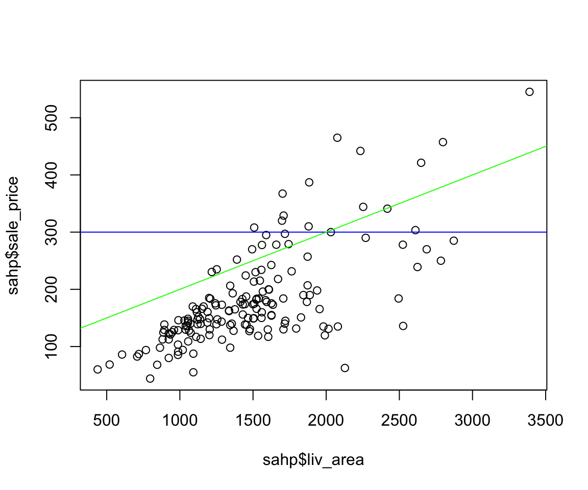
In addition to adding vertical lines and horizontal lines, you can also add any line with the abline() function. We know a line can be represented as a function \(y = a + b\times x\), where \(a\) is the intercept and \(b\) is the slope. In the abline(), you can generate such a line by specifying the parameter a for the intercept and b for the slope. Note that you can run abline() multiple times to add multiple lines.
plot(sahp$liv_area, sahp$sale_price)
abline(h = 300, col = "blue")
abline(a = 100, b = 0.1, col = "green") 
7.3.2 Using geom_hline(), geom_vline() and geom_abline()
Let’s first review the following scatterplot between liv_area and sale_price.
library(r02pro)
library(tidyverse)
ggplot(data = sahp) +
  geom_point(mapping = aes(x = liv_area, y = sale_price))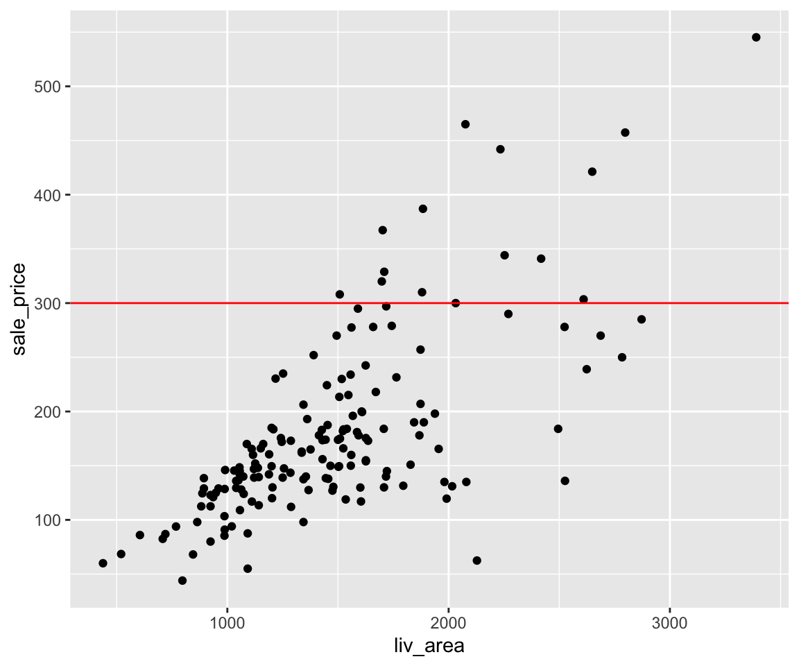
Looking at the scatterplot, it maybe helpful to add a horizontal line. To do this, you can use the geom_hline() function with argument yintercept specifying the value on the y-axis.
ggplot(data = sahp) +
  geom_point(mapping = aes(x = liv_area, y = sale_price)) +
  geom_hline(yintercept = 300, color = "red")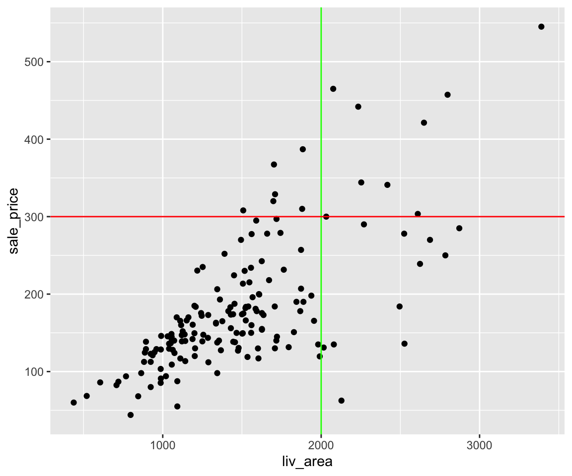
Here, a horizontal line at 300 is added to the scatterplot.
You can also add both vertical lines and horizontal lines to the same plot.
ggplot(data = sahp) +
  geom_point(mapping = aes(x = liv_area, y = sale_price)) +
  geom_vline(xintercept = 2000, color = "green") +
  geom_hline(yintercept = 300, color = "red")
In addition to adding vertical lines and horizontal lines, you can also add any line with the geom_abline() function. We know a line can be represented as a function \(y = a + b\times x\), where \(a\) is the intercept and \(b\) is the slope. In the geom_abline(), you can generate such a line by specifying the slope and intercept arguments.
ggplot(data = sahp) +
  geom_point(mapping = aes(x = liv_area, y = sale_price)) +
  geom_abline(slope = 0.1, intercept = 100, color = "blue")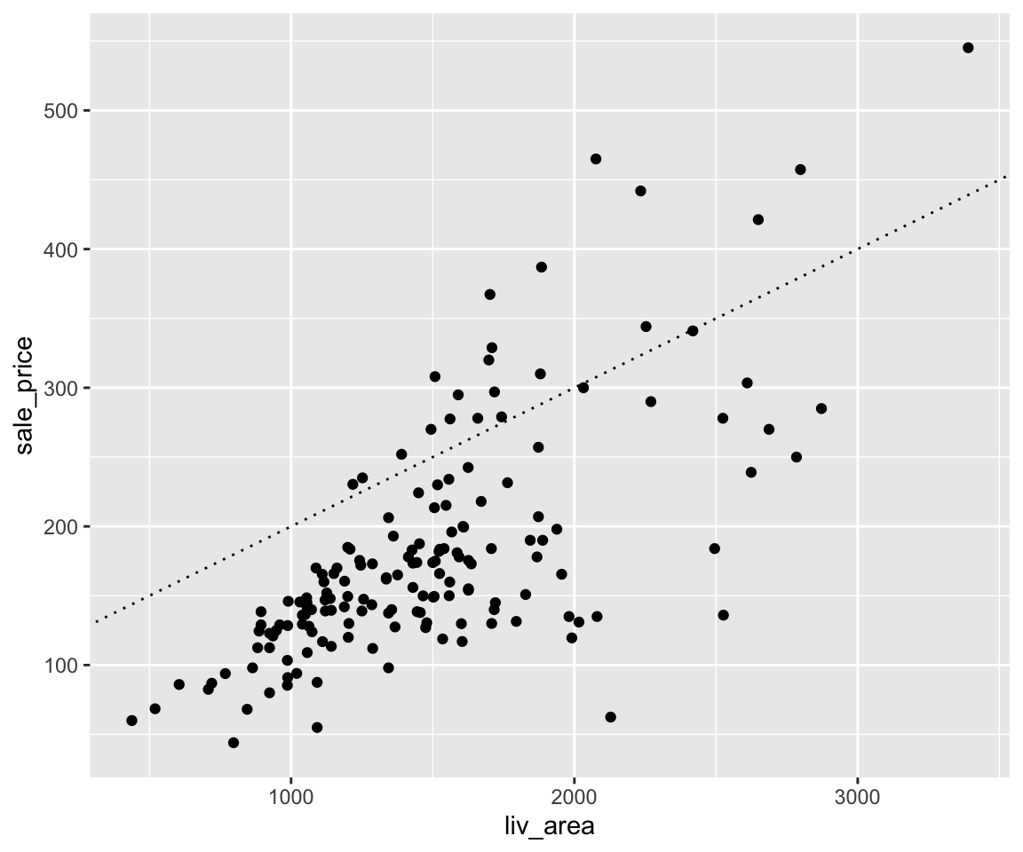
Similar to smoothline fit and line plots, you can change line type here. Different numbers correspond to different line types.
ggplot(data = sahp) +
  geom_point(mapping = aes(x = liv_area, y = sale_price)) +
geom_abline(slope = 0.1, intercept = 100, linetype = 3) 
7.3.3 Exercises
- Using the
sahpdata, usingplot()to generate a scatterplot betweenlot_area(x-axis) andsale_price(y-axis), and add horizontal lines at 150 with color “blue” and 200 with color “red”. - Using the
sahpdata, usingggplot()to generate a scatterplot betweensale_price(x-axis) andliv_area(y-axis), and add the following lines to the plot:
- \(y = 5\times x + 1000\) (in green color, dashed line)
- \(y = 3\times x + 1500\) (in purple color, solid line)
