6.12 Arrange Multiple Plots
So far, you have mastered many geoms, and you know one popular way to add the information of additional variables to a plot is mapping them to certain aesthetics. Another way to achieve this goal is to divide the data into different groups according to the additional variables, generate different plots for each group, and arrange the plots into facets. This is particularly useful for categorical variables.
Let’s use the sahp dataset and generate a scatterplot for sale_price vs. liv_area and save it as g.
library(ggplot2)
library(r02pro)
g <- ggplot(data = na.omit(sahp)) +
  geom_point(mapping = aes(x = liv_area,
                           y = sale_price))
6.12.1 Facet wrap
The first function is called facet_wrap(), which generate separate plots for each category and wrap the plots into 2d panels.
Let’s first divide to data according to oa_qual.
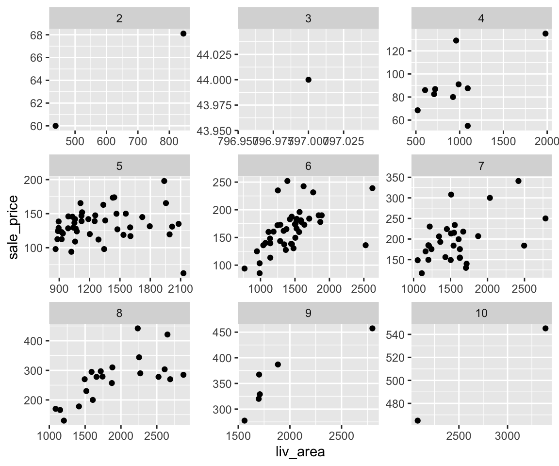
You can see that there are nine different scatterplots between sale_price and liv_area according to the value of oa_qual. The scatterplots are nicely arranged in a 3-by-3 grid with the value of oa_qual on top of each subplot.
Note that the scales of all nine plots are the same, which make it straightforward to compare between different groups. On the other hand, the points for some of the groups (e.g., oa_qual == 5) are scrambled together, making us difficult to see the details. To make the subplots having their own scales, you can set scales = "free".
From the plot, it is clear that each subplot has its own scale depending on the data range in the subset of the data. If you want to make the subplots to have fixed scale only on the x-axis or the y-axis, you can set scales = "free_y" or scales = "free_x" respectively.
In addition to the default layout, you can set the desired number of rows or columns. For example, to arrange the plots in two rows for the variable kit_qual, you can use
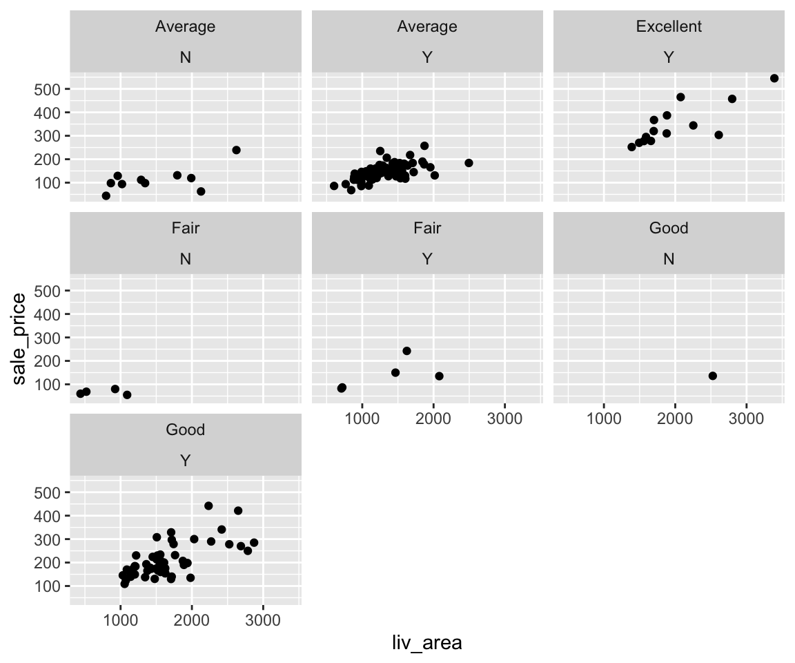
In addition to using one variable to form the subgroups, you can also use multiple variables by using a vector of their names in the facet_wrap() function.
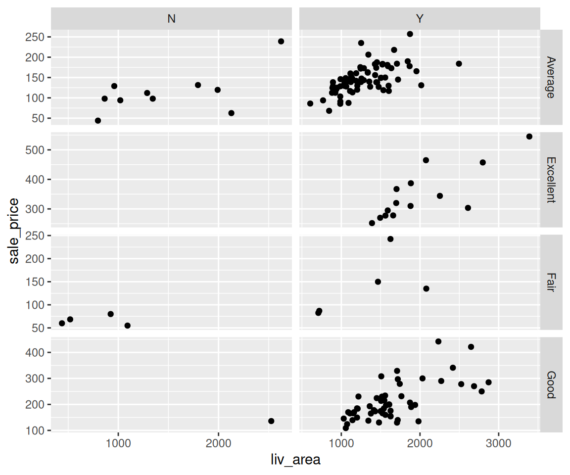
This will show the plots for combinations of kit_qual and central_air. For example, the top left plot is the scatterplot between liv_area and sale_price for houses with kit_qual == "Average" and central_air == "N". Let’s find out how many different values are there for kit_qual and central_air.
unique(sahp$kit_qual)
#> [1] "Good"      "Average"   "Fair"      "Excellent"
unique(sahp$central_air)
#> [1] "Y" "N"
Clearly, there are in total eight possible combinations of values for these two variables. Upon a careful look, you may realize there is no plot for kit_qual == "Excellent" and central_air == "N". The reason is due to the fact there are no houses satisfying both criteria. Let’s verify as follows.
Note that the facet_wrap() function can be combined with any geoms we have learned. Let’s see an example of bar charts.

6.12.2 Facet grid

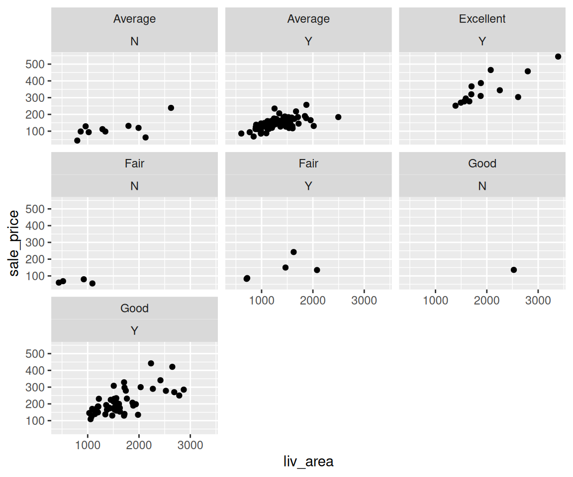
In addition to facet wrap, you can also use the function facet_grid() to form a matrix of plots defined by row and column faceting variables. It is mostly useful when you have two discrete variables, and most combinations of the variables exist in the data.
Comparing with the plot generated by facet_wrap(), facet_grid() will also show empty plots if there are no observations with certain combinations, e.g. kit_qual == "Excellent" and central_air == "N". This particular way to arrange plots is very informative.
Similar to facet_wrap(), you can also allow the scales of each subplot to be different by setting the scales argument.
6.12.3 Exercises
Use the sahp data set to answer the following questions.
- Create a boxplot for
liv_areaand assign it to the name my_boxplot. - Using
my_boxplotin Q1, generate separate plots according to the value ofbedroom. What conclusions can you draw from the plot? - Using
my_boxplotin Q1, generate a matrix of subplots with kitchen quality (kit_qual) as the row and whether the house has central ac (central_air) as the column. Do you see a subplot for all combinations ofkit_qualandcentral_air? If not, explain the reason.
