6.11 Boxplots
So far, we have learned two ways to visualize a continuous variable, namely the histograms (Section 6.9) and density plots (Section 6.10). Now, we introduce another popular plot for visualizing the distribution of a continuous variable: the boxplot. Let’s say we want to generate a boxplot for the variable sale_price in the sahp dataset.
6.11.1 Using the boxplot() function
To generate a boxplot, you can just use boxplot() with the variable as the argument.
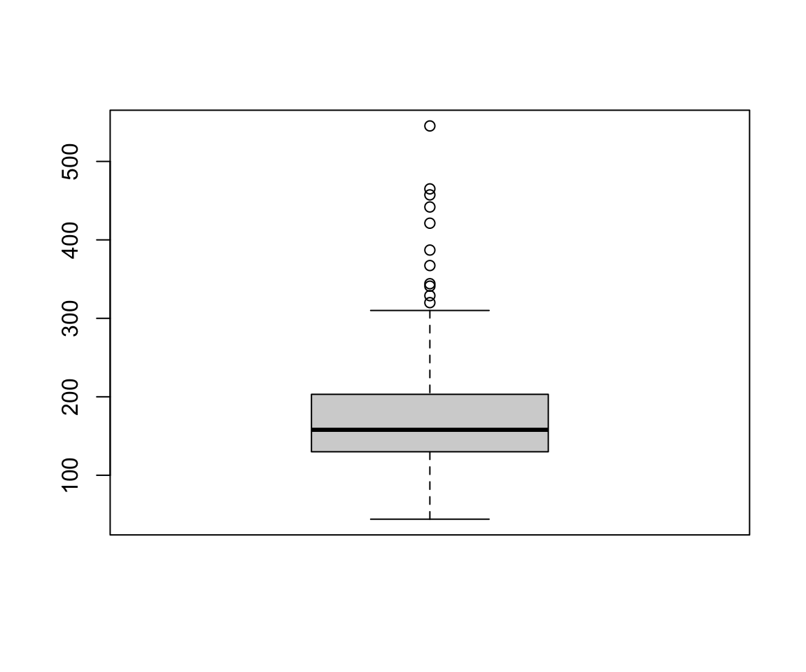
The boxplot compactly summarize the distribution of a continuous variable by visualizing five summary statistics (the median, two hinges, and two whiskers), and show all “outlying” points individually. All five summary statistics on the boxplot are related to the summary statistics we learned in Section 3.3. Let’s first review the summary function and the inter quartile range (IQR).
summary(sale_price)
#>    Min. 1st Qu.  Median    Mean 3rd Qu.    Max.
#>    44.0   130.0   157.9   179.9   201.6   545.2
IQR(sale_price)
#> [1] 71.6125
Let’s discuss the five lines on the boxplot.
- The solid line in the middle represents the median value, which is 157.95.
- The lower solid line, also known as the lower hinge, is the first quartile Q1 = 129.9625.
- The upper solid line, also known as the upper hinge, is the third quartile Q3 = 201.575.
- The lower whisker is the smallest observation value that is greater than or equal to Q1 - 1.5 * IQR. To find this value, we first calculate Q1 - 1.5 * IQR = 22.54375. Then, the smallest observation larger than 22.54375 is
lower_whisker_loc <- which(sale_price >=
                             quantile(sale_price, 0.25) - 1.5 * IQR(sale_price))
min(sale_price[lower_whisker_loc])
#> [1] 44- The upper whisker is the largest observation value that is smaller than or equal to Q3 + 1.5 * IQR. Similarly, the value is
upper_whisker_loc <- which(sale_price <=
                             quantile(sale_price, 0.75) + 1.5 * IQR(sale_price))
max(sale_price[upper_whisker_loc])
#> [1] 308.03
To summarize, the five lines on the boxplot, from the top to bottom, are
- upper whisker (<= Q3 + 1.5*IQR)
- upper hinge (Q3)
- median (50-th percentile)
- lower hinge (Q1)
- lower whisker (>= Q1 - 1.5*IQR)
For the observations that are larger than the upper whisker or smaller than the lower whisker, the points are shown individually as outliers.
6.11.2 Using the geom_boxplot() function
As before, we will spend more time to discuss geom_boxplot() as it provides more functionality. Let’s first create the boxplot for sale_price.

Note that here we set x = "" since no information is needed on the x-axis.
In addition to the default summary statistics, we can add other values to the boxplot, for example, we can add the mean value to the plot.
ggplot(data = sahp, aes(x = "", y = sale_price)) +
  geom_boxplot() +
  geom_point(stat = "summary",
             fun = "mean",
             shape = 20,
             size = 4,
             color = "red")
The geom_point() function will first calculate the mean hwy, and add it to the boxplot. Note that we used some global aesthetics for geom_point().
6.11.3 Compare distributions in different groups
One common use of boxplot is to compare the distribution of a continuous variable in different groups. To do this, you just need to set the x-axis to be the discrete variable that encodes the different groups.
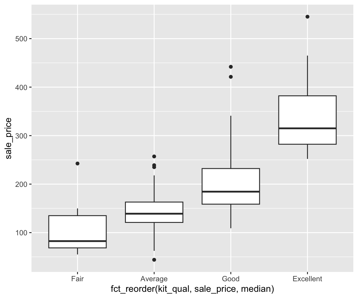
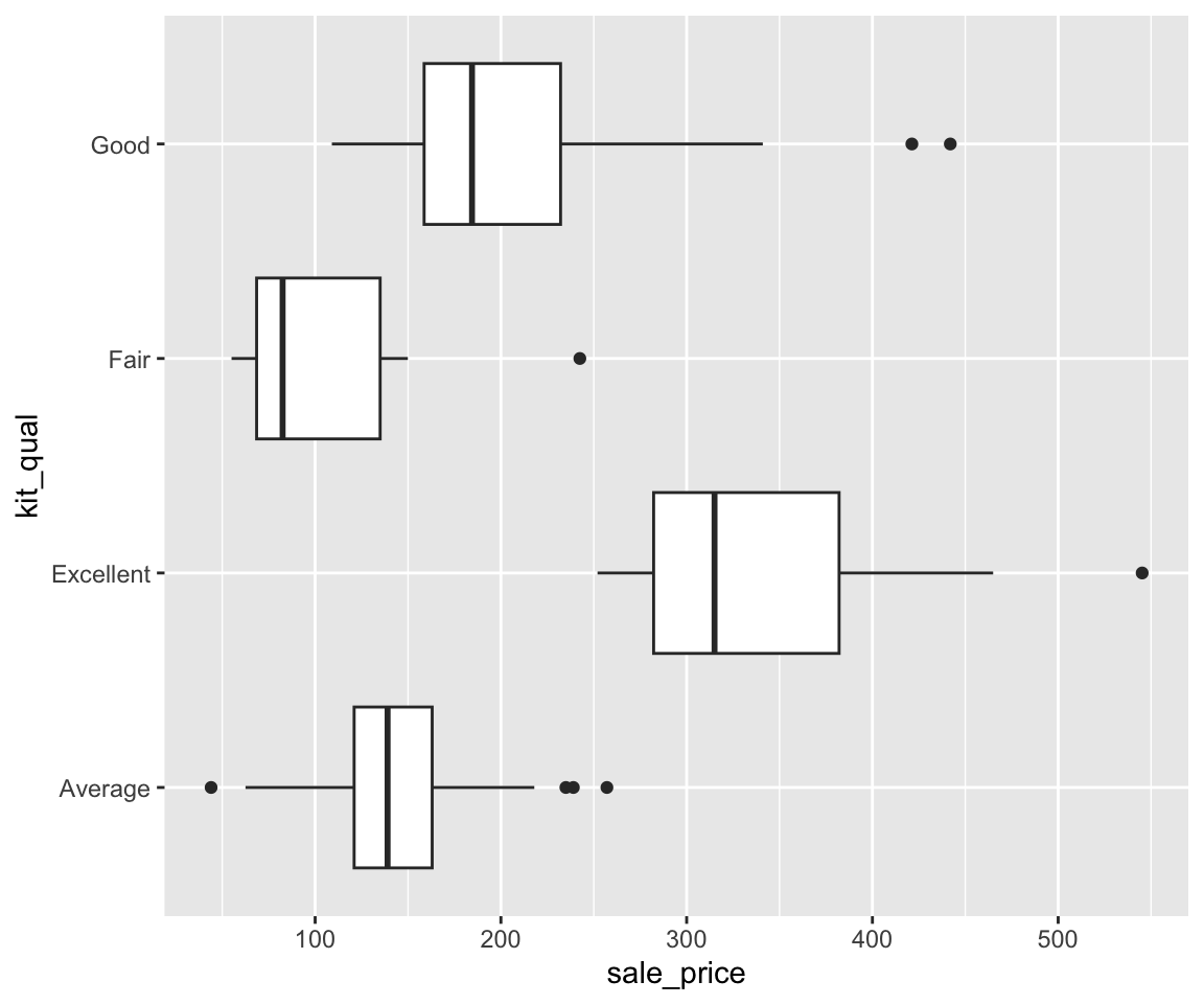
Let’s say we want to compare the sale_price for houses with different kit_qual.
ggplot(data = gm2004 %>% remove_missing(vars="HDI_category")) +
  geom_boxplot(aes(x = HDI_category,
                   y = log(GDP_per_capita)))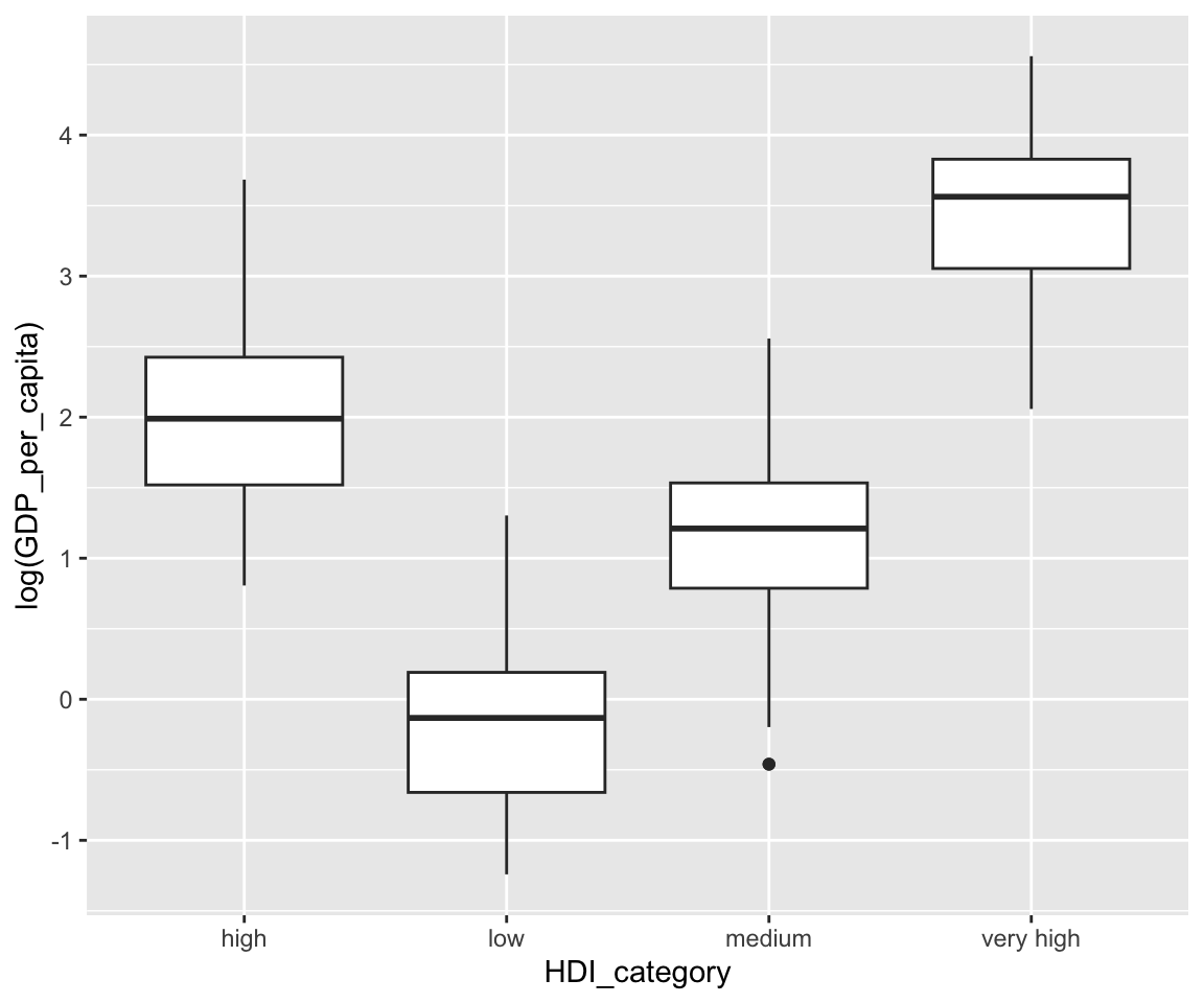
This plot shows the boxplots of sale_price for different values of kit_qual side-by-side, which makes the comparison of distributions straightforward.
Just like in bar charts, you may want to arrange the boxplots in a particular order. For example, to order the boxplots in ascending order of the sale_price, you can use
ggplot(data = remove_missing(sahp, vars = "sale_price")) +
  geom_boxplot(aes(x = fct_reorder(kit_qual,
                                   sale_price,
                                   median),
y = sale_price)) 
To order it by the mean sale_price in descending order, you can use
ggplot(data = remove_missing(sahp, vars = "sale_price")) +
  geom_boxplot(aes(x = fct_reorder(kit_qual,
                                   sale_price,
                                   mean,
                                   .desc = TRUE),
y = sale_price)) 
If you want to generate a flipped version of the boxplot, you can add coord_flip() to the ggplot() function. Actually, this works with any ggplot.
As an alternative, you can also switch the x and y arguments.
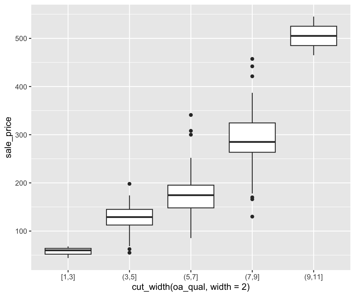
Now, you have learned how to compare the distributions of a continuous variable for different groups implied by a discrete variable. How about groups implied by a continuous variable? To do this, you can use the function cut_width() to convert a continuous variable to a discrete one by dividing the observations into different groups, just like in histograms. Let’s try to convert the continuous variable oa_qual into a discrete one.
cut_width(sahp$oa_qual, width = 2)
#>   [1] (5,7]  (5,7]  (3,5]  (3,5]  (5,7]  (5,7]  (5,7]  (3,5]  (3,5]  (3,5]
#>  [11] (5,7]  (5,7]  (3,5]  (7,9]  (5,7]  (3,5]  (3,5]  (3,5]  (5,7]  (5,7]
#>  [21] (3,5]  (7,9]  (7,9]  <NA>   (5,7]  (3,5]  (3,5]  (3,5]  (3,5]  (7,9]
#>  [31] (7,9]  (7,9]  (5,7]  (7,9]  (5,7]  (3,5]  (5,7]  (5,7]  (3,5]  (3,5]
#>  [41] (9,11] (3,5]  (3,5]  (3,5]  (7,9]  (3,5]  (5,7]  (3,5]  (5,7]  (5,7]
#>  [51] (3,5]  (5,7]  (5,7]  (3,5]  (5,7]  (5,7]  (7,9]  (7,9]  (3,5]  (5,7]
#>  [61] (5,7]  (5,7]  (5,7]  (5,7]  (3,5]  (3,5]  (5,7]  (5,7]  (3,5]  (5,7]
#>  [71] (5,7]  (3,5]  (7,9]  (5,7]  (3,5]  (7,9]  (7,9]  (3,5]  [1,3]  (5,7]
#>  [81] (5,7]  (5,7]  (3,5]  (5,7]  (5,7]  (3,5]  (3,5]  (5,7]  (3,5]  (3,5]
#>  [91] (7,9]  (5,7]  (5,7]  (5,7]  (5,7]  (3,5]  (5,7]  (3,5]  (9,11] (5,7]
#> [101] (5,7]  (7,9]  (3,5]  (5,7]  (3,5]  (5,7]  (5,7]  (3,5]  (3,5]  (5,7]
#> [111] (5,7]  (5,7]  (7,9]  (7,9]  (7,9]  (5,7]  (7,9]  (5,7]  (5,7]  (5,7]
#> [121] (5,7]  (5,7]  (3,5]  (3,5]  (5,7]  (5,7]  (3,5]  (7,9]  (5,7]  (5,7]
#> [131] (3,5]  (7,9]  (5,7]  (5,7]  (5,7]  (5,7]  (5,7]  [1,3]  (3,5]  (5,7]
#> [141] (3,5]  (5,7]  (5,7]  (3,5]  (3,5]  (3,5]  (3,5]  (3,5]  (3,5]  (5,7]
#> [151] (7,9]  (7,9]  (3,5]  (5,7]  (7,9]  [1,3]  (7,9]  (7,9]  (5,7]  (5,7]
#> [161] (7,9]  (5,7]  (3,5]  (5,7]  (3,5]
#> Levels: [1,3] (3,5] (5,7] (7,9] (9,11]
The working mechanism of cut_width() is that it makes groups of width width and create a factor with the levels be the different groups. For example, the first observation has oa_qual = 6, belong to the (5,7] group.
Note there are also functions cut_interval() and cut_number() which also discretise continuous variable into a discrete one by making groups with equal range and equal number of observations, respectively.
Now, you can compare the distributions of a continuous variable on the constructed groups from another continuous variable.
ggplot(data = remove_missing(sahp, vars="oa_qual")) +
  geom_boxplot(aes(x = cut_width(oa_qual, width = 2),
                   y = sale_price))
This agrees perfectly with our intuition that houses with higher overall quality have higher sale prices.
6.11.4 Aesthetics in Boxplots
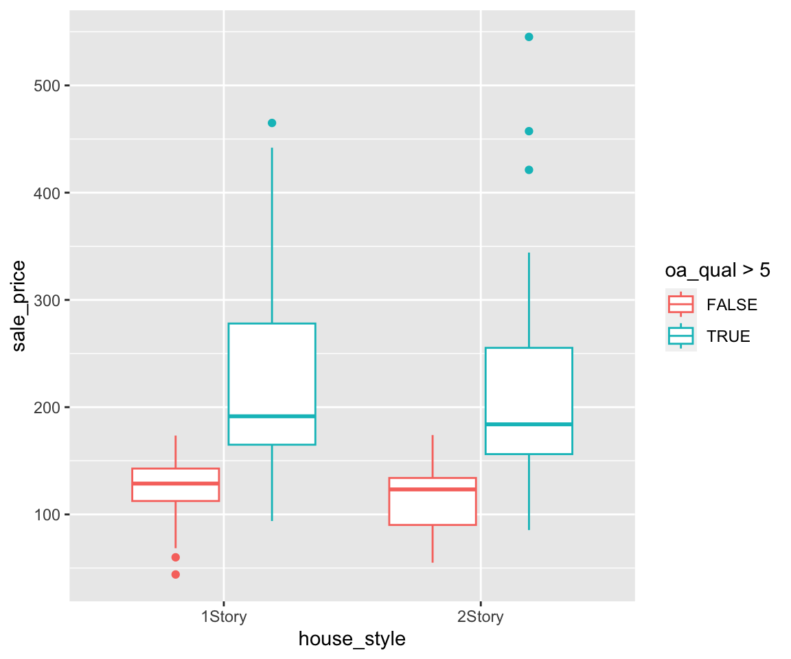
Before talking about aesthetics, let’s create a boxplot of sale_price for different values of house_style.
ggplot(data = na.omit(sahp),
       aes(x = house_style,
           y = sale_price)) +
  geom_boxplot() +
  scale_x_discrete(limits=c("1Story", "2Story"))
Note that we only show the two boxplots with house_style equaling "1Story" or "2Story". To simply the codes, it is sometimes helpful to store the intermediate plot object and build additional plots on top of it. For example, we can generate the same boxplot using the following two steps.
g <- ggplot(data = na.omit(sahp),
            aes(x = house_style,
                y = sale_price)) +
  scale_x_discrete(limits=c("1Story", "2Story"))
g + geom_boxplot()
a. Map the grouping variable to color
First, let’s try to map the variable house_style to the color aesthetic.

We can see that the boxplots have different colors according to the value of house_style.
b. Map the grouping variable to fill
You can also use the fill aesthetic to fill in the boxes with different colors according to the value of house_style.
c. Map a third variable to color
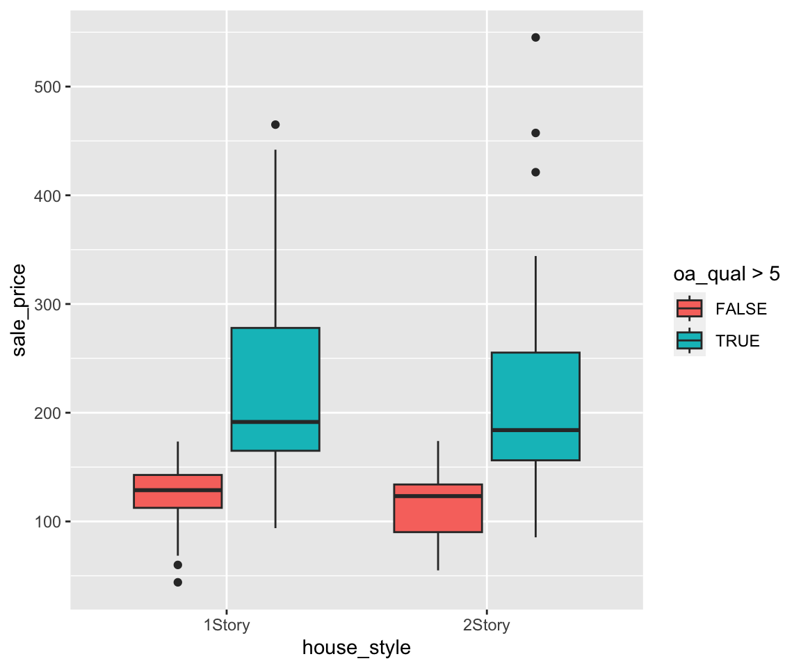
So far, we have only mapped the discrete variable on the x-axis to the aesthetic. You can map a third variable to an aesthetic if a further refined comparision is needed. Let’s try to map the oa_qual > 5 to color.
You will get a boxplot for each combination of house_style and oa_qual grouped by the variable house_style, just like when we create the bar charts in Section 6.8.
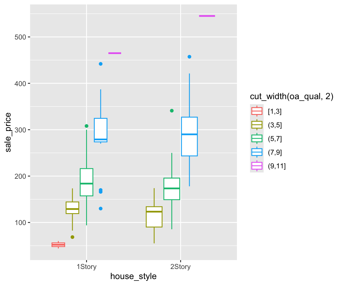
As before, you can also cut a continuous variable and map it to aesthetic.
d. Map a third variable to fill
Similarly, you can also map the variable to the fill aesthetic.
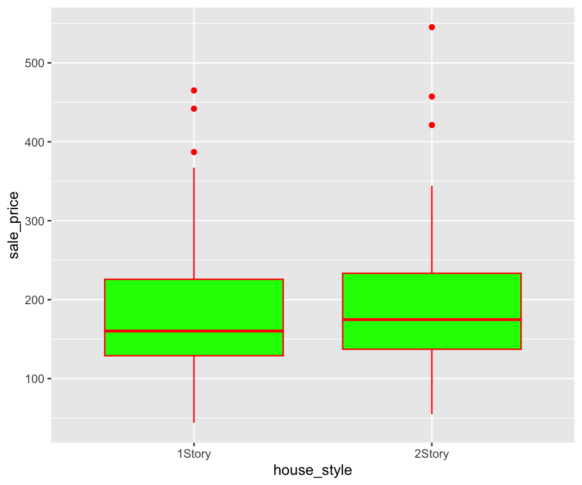
e. Constant-Valued Aesthetics
In addition to mapping variables to aesthetics, you can also use Constant-Valued Aesthetics in boxplot. For example, to make the box green and the lines and points red, you can use
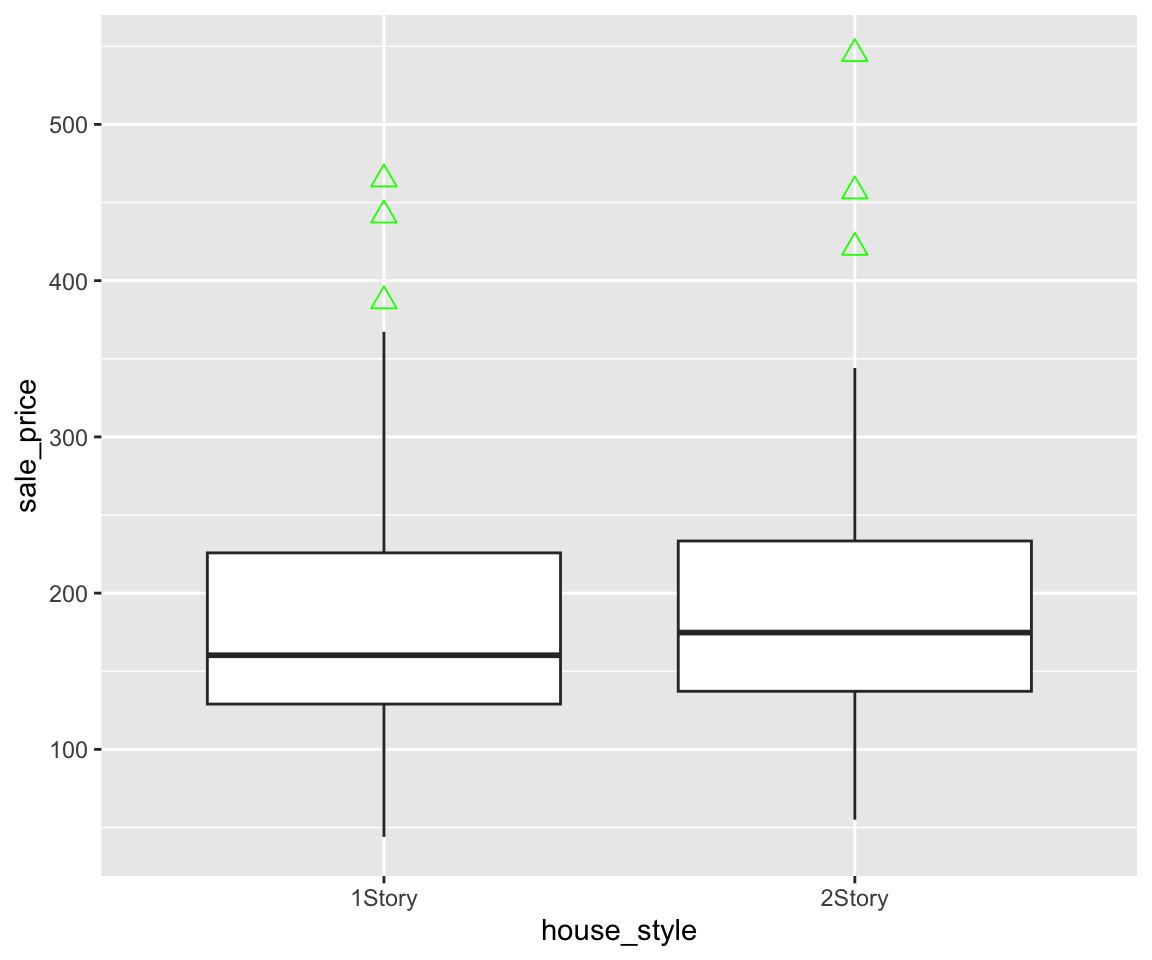
If you want to change the shape and size of the outliers, you can set the arguments outlier.shape and outlier.size.

6.11.5 Notched Boxplots
In addition to the regular boxplot, there is a more sophisticated version, called notched boxplot. We can generate such a boxplot by setting the global aesthetic notch = TRUE in the geom_boxplot() function.
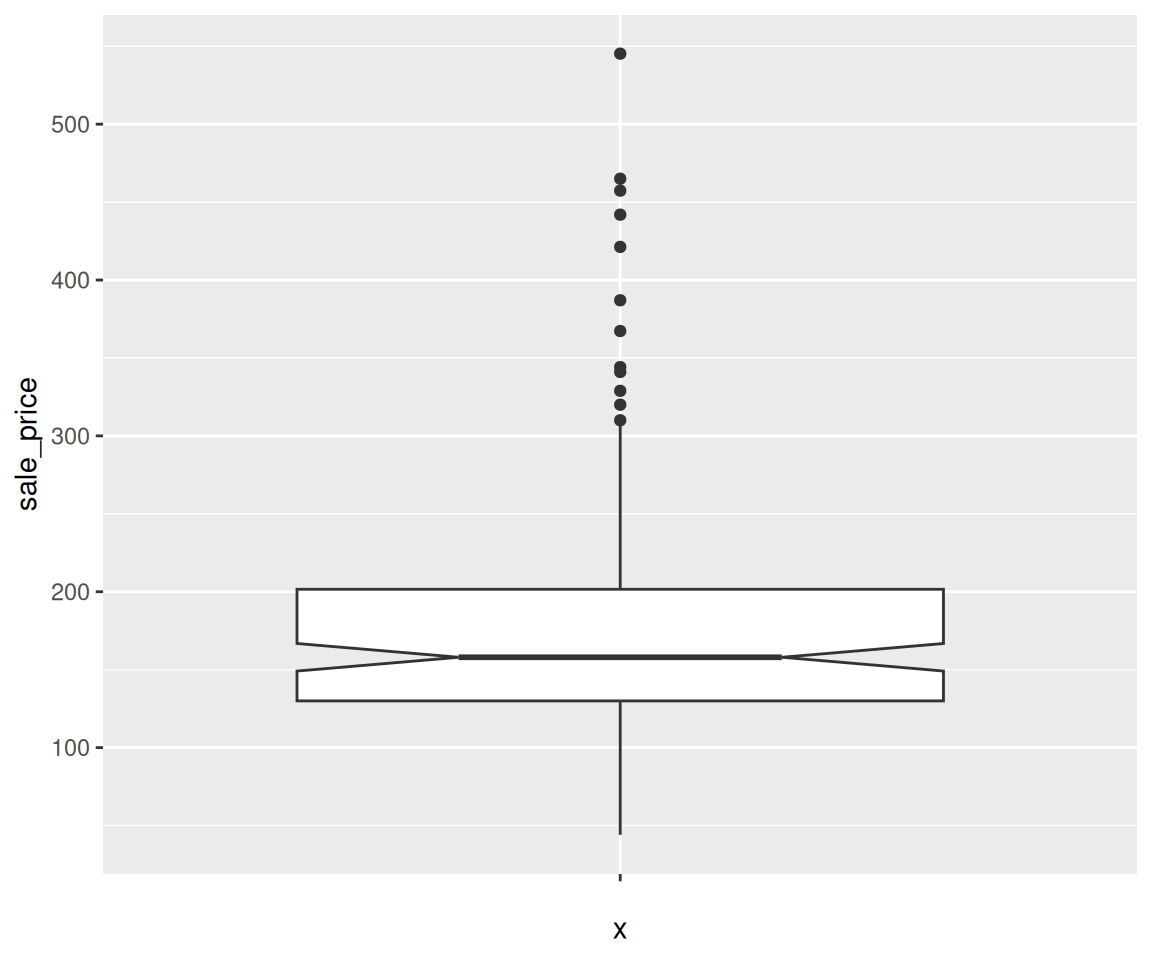
In a notched box plot, a notch is generated around the median, with the vertical width on each side being 1.58 times IQR divided by the squared root of the sample size: \(1.58 * IQR / sqrt(n)\). This gives a roughly 95% confidence interval for the median. As a result, if the notches of two boxplots do not overlap, it offers evidence of a statistically significant difference between the two medians. In this example, the upper and lower points of the notch are
6.11.6 Exercises
Use the sahp data set to answer the following questions.
- Create a boxplot on the living area (
liv_area) and find out the following values on the boxplot using R codes.
- solid line in the middle
- lower hinge
- upper hinge
- lower whisker
- upper whisker
Create a boxplot to compare the distribution of living area (
liv_area) for different values of kitchen quality (kit_qual). What conclusions can you draw from the plot?For the boxplot in Q2, for different
kit_qualvalues, add the following three points to the plot.
- minimum
liv_areavalue (in red) - maximum
liv_areavalue (in blue) - the mean
liv_areavalue (in green)
For the boxplot in Q2, order it by the mean
lot_areavalue in ascending order.For the boxplot in Q2, use different colors to represent whether
oa_qualis larger than 5.
