6.1 Scatterplot
Starting from this section, you will learn various kinds of plots, that involves one or more variables in a data set.
Let’s first look at the gapminder data set gm2004. We would like to learn the relationship between sugar and cholesterol.
To visualize the relationship between two continuous variables, one of the most commonly used plots is the scatterplot, which is a 2-dimensional plot with a collection of all the datapoints, where the x-axis and y-axis correspond to the two variables, respectively.
6.1.1 Using the plot() function
In base R, you can use the plot() function to generate a scatterplot with the first argument as the variable on the x-axis and the second argument as the variable on the y-axis.
From the scatterplot, you can see a clear increasing trend between sugar and cholesterol, which is consistent with our intuition. The plot() function provides a rich capability of customization by setting the graphical parameters. We summarize a few commonly used parameters for scatterplots as below.
| Parameter | Meaning | Example |
|---|---|---|
col |
Color | “red” |
xlab |
A title for the x-axis | “Sugar” |
ylab |
A title for the y-axis | “Cholesterol” |
main |
An overall title for the plot | “Cholesterol vs. Sugar” |
pch |
Shape of the points | 2 |
cex |
Size of text and symbols | 2 |
A collection of shapes and their associated integers are as below.
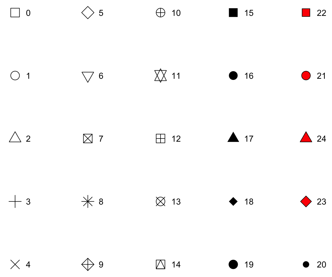
Figure 6.1: All Possible Shapes
Let’s see the effect of these parameters in the following example.
plot(gm2004$sugar,
     gm2004$cholesterol,
     col = "red",
     xlab = "Sugar",
     ylab = "Cholesterol",
     main = "Cholesterol vs. Sugar",
     pch = 2,
     cex = 2)
6.1.2 Interacting and Saving the plot from plot()
After generating the plot, there are many convenient options in the “Plots” panel of RStudio that allow us to interact with the plot.
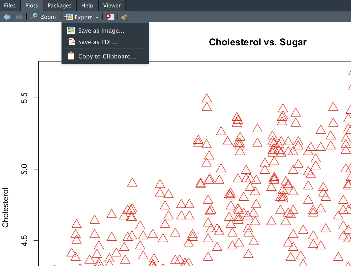
Figure 6.2: Plots Panel Options
Here are a few options.
- Zoom: The figure will be detached as a separate window in RStudio. You can then drag it around or adjust its size freely just like any other window.
- Export (Save as Image): You can choose the Image Format, change the Directory, customize the File Name, and set the Width and Height.
- Export (Save as PDF): You can choose the PDF Size, Orientation (Portrait or Landscape), Directory, and File Name.
- Export (Copy to Clipboard): This option is useful if you just want to immediately paste the picture into another document such as a Word document, Preview, or email message. Before copying, you can also customize the width and height.
In addition to using the menu options, you can also write script to automatically save the plot to your desired local directory. To do that, you need to do the following three steps:
- Specify a file which will serve as the output device for the
plot()function. You can use functionspng(),jpeg(),png(), andpdf()with the target file name as the argument. - Run the
plot()function. - Run
dev.off()to close the connection.
Let’s see an example.
Note that when you use the .pdf format, you can have multiple plots generated from the plot() before running dev.off(). In this case, the output .pdf file will contain multiple pages where each page corresponds to a plot.
6.1.3 Using the ggplot() function
Although the plot() function gets the work done, the ggplot2 package provides a superior user experience which allows us to create complex plots with ease. Since the ggplot2 package is a member of the tidyverse package, you don’t need to install it separately if tidyverse was already installed. Let’s first load the package ggplot2 and create a scatterplot.
Aside from the expected scatterplot, you can see a warning message “Removed 128 rows containing missing values (geom_point).” This indicates that there are 128 rows in gm2004 that contains missing values for sugar and/or cholesterol (see Section 3.10 for a detailed treatment of missing values) and they are removed during the plotting process. The removal of missing values for relevant variables is a default behavior for all plots generated by the ggplot2 package.
Now, let’s walk through the mechanism of ggplot2. In a nutshell, ggplot2 implements the grammar of graphics, a coherent system for describing and building graphs. The core idea is simple: every plot is built up in layers, starting from the data, then specifying how variables map to visual properties (aesthetics such as x-position, y-position, color, or size), and finally choosing geometric shapes (geoms, such as points or bars) to draw. Because each step is independent, you can mix and match the pieces to describe an enormous variety of plots with one consistent syntax. A more detailed description of the grammar of graphics can be found in Wickham (2010).
Let’s break it down into two steps. In ggplot2, we always start with the function ggplot() with a data frame or tibble as its argument.
After running this code, you can see an empty plot. This is because ggplot does not yet know which variables or what type of plots you want to create. To generate a scatterplot, you can add a layer using the + operator followed by the geom_point() function. The geom_point() is one of the many available geoms in ggplot.
Inside geom_point(), you need to set the value of the mapping argument. The mapping argument takes a functional form as mapping = aes(), where the aes is short for aesthetics. For example, you can use aes() to tell ggplot to use which variable on the x-axis and which variable on the y-axis. Let’s take another look at this example.
Here, inside the aes() function, we set x = sugar and y = cholesterol, indicating that the variable sugar will appear on the x-axis and cholesterol will appear on the y-axis.
When creating a ggplot, we recommend starting a new line after each + and also put the arguments of the aes() function on separate lines for better readability.
Now, let’s look at another example. We would like to explore the relationship between GDP_per_capita and life_expectancy.
We can see that life_expectancy in general increases (in a non-linear fashion) as GDP_per_capita increases, which is also consistent with our knowledge. From the figure, you can see that there is a pretty heavy left tail for GDP_per_capita — most countries are clustered near zero while a few are very high. This is a common situation for variables that span several orders of magnitude (here, from a few hundred to tens of thousands of dollars).
A standard remedy is to apply a log transformation to such a variable before plotting. Log transformations compress large values and spread out small values, which makes patterns at the low end easier to see and often turns curved relationships into more nearly linear ones. You can apply the transformation directly inside the aesthetic mapping — there is no need to create a separate transformed column.
After the logarithm transformation, the points are more evenly spread along the x-axis and the relationship between GDP_per_capita and life_expectancy looks much closer to linear.
6.1.4 Interact and Save the plot from ggplot()
After generating the plot using ggplot(), you can use exactly the same menu options for interacting the plot as for plot().
However, the mechanism for saving plots from ggplot() is completely different from that of plot(). To save a plot from ggplot(), you just need to use the ggsave() function after generating the plot without first setting up the connection to the file. The ggsave() function is very smart in the sense that it will automatically save the plot to the desired format depending on the extension of the given file name.
6.1.5 Exercises
Using the
sahpdataset, create a scatterplot to visualize the relationship betweenliv_area(on the x-axis) andsale_price(on the y-axis) without using any package, then set labels according to variable names and change all points to red. Finally, save the plot todata/sale_price_vs_liv_area.jpgand discuss the findings.Using the
gm2004dataset, create a scatterplot to visualize the relationship betweensanitation(on the x-axis) andlife_expectancy(on the y-axis) using the ggplot2 package. Finally, save the plot todata/life_expectancy_vs_sanitation.pdfand discuss the findings.
References
