4.2 Scatterplots
From this section, you will learn various kinds of plots, that involves one or more variables in a data set. Considering the housing prices, a natural question you may have is that are the bigger houses more expensive?
To answer this question, you need to look at the relationship between liv_area and the sale_price in the sahp data set.
To visualize the relationship between two continuous variables, the most commonly used plot is the scatterplot, which is a 2-dimensional plot with a collection of all the datapoints, where the x-axis and y-axis correspond to the two variables, respectively.
4.2.1 Using the plot() function
In base R, we can use the plot() function to generate this scatterplot with the first argument being the variable on the x-axis and the second argument being the variable on the y-axis.
library(r02pro)
plot(sahp$liv_area, sahp$sale_price)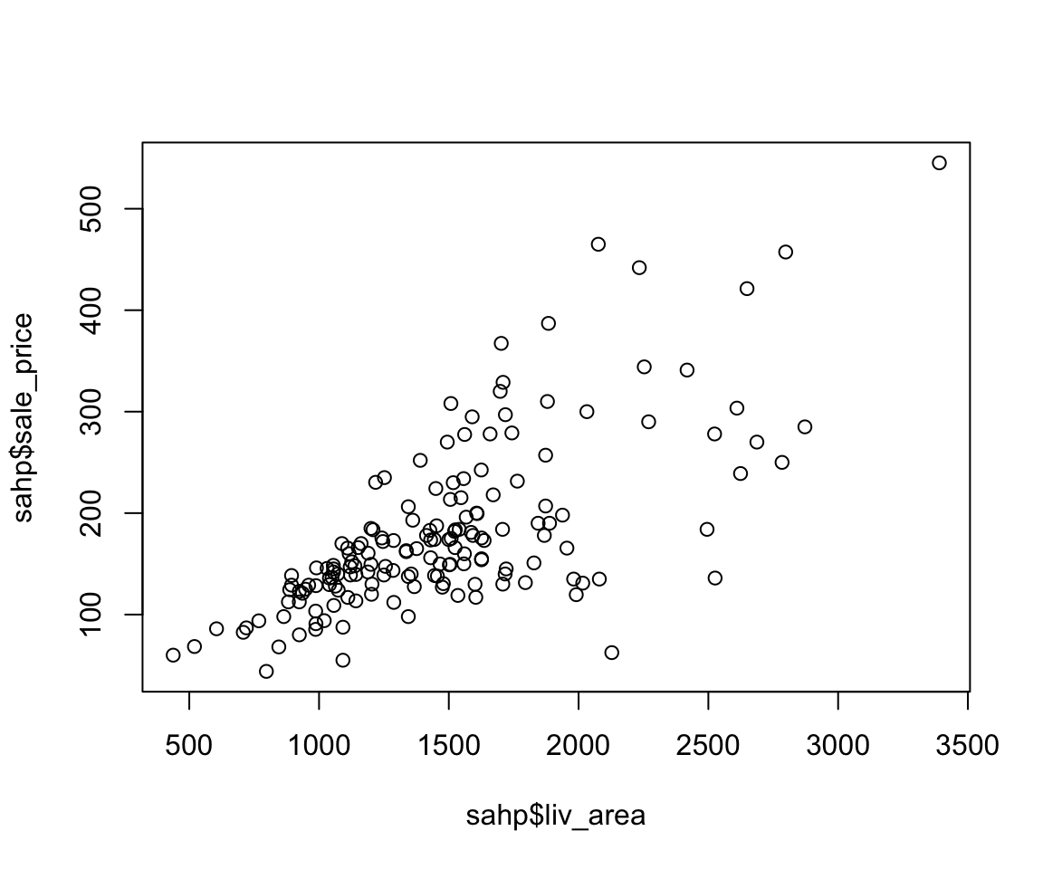
From the scatterplot, we can see a clear increasing trend between sale_price and liv_area, which is consistent with our intuition. The plot() function provides a rich capability of customization by setting the graphical parameters. We summarize a few commonly used parameters for scatterplots as below.
| Parameter | Meaning | Example |
|---|---|---|
col |
Color | “red” |
xlab |
A title for the x-axis | “Living Area” |
ylab |
A title for the y-axis | “Sale Price” |
main |
An overall title for the plot | “Sale Price vs. Living Area” |
pch |
Shape of the points | 2 |
cex |
Size of text and symbols | 2 |
Let’s see the effect of these parameters in the following example.
plot(sahp$liv_area, sahp$sale_price,
     col = "red",
     xlab = "Living Area",
     ylab = "Sale Price",
     main = "Sale Price vs. Living Area",
     pch = 2,
     cex = 2)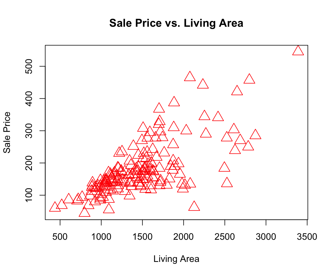
4.2.2 Using the ggplot() function
Although the plot() function gets the work done, the ggplot2 package provides a superior user experience which allows us to create complex plots with ease. Since the ggplot2 package is a member of the tidyverse package, you don’t need to install it separately if tidyverse was already installed. Let’s first load the package ggplot2 and create a scatterplot.
library(ggplot2)
ggplot(data = sahp) +
  geom_point(mapping = aes(x = liv_area, y = sale_price))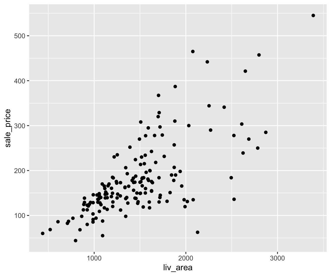
Aside from the expected scatterplot, you can see a warning message “Removed 1 rows containing missing values (geom_point).” This indicate that there is 1 row in sahp that contains missing values and it was removed during the plotting process. The removal of missing values is a default behavior for all plots generated by the ggplot2 package.
Now, let’s walk through the mechanism of ggplot2. In a nutshell, ggplot2 implements the grammar of graphics, a coherent system for describing and building graphs. A more detailed description on the grammar of graphics can be found in Wickham (2010).
Let’s break it down into two steps. In ggplot2, we always start with the function ggplot() with a data frame or tibble as its argument.
ggplot(data = sahp)
After running this code, you can see an empty plot. This is because ggplot does not yet know which variables or what type of plots you want to create. To generate a scatterplot, you can use add a layer using the + operator followed by the geom_point() function. The geom_point() is one of the many available geoms in ggplot.
Inside geom_point(), you need to set the value of the mapping argument. The mapping argument takes a functional form as mapping = aes(), where the aes is short for aesthetics. For example, you can use aes() to tell ggplot to use which variable on the x-axis, which variable on the y-axis. Let’s take another look at this example.
ggplot(data = sahp) +
  geom_point(mapping = aes(x = liv_area, y = sale_price))
Here, inside the aes() function, we set x = liv_area and y = sale_price, indicating that the variable liv_area will appear on the x-axis and sale_price will appear on the y-axis.